Prism does not understand the concept of dates or times, so you cannot enter times or dates as X values. But you can get Prism to plot dates or times as row titles.
Note that Prism does not try to interpret the meaning of row titles. To Prism, you just entered labels. The data will always appear equally spaced on the graph, even if the dates are not equally spaced chronologically. Most of the time, your dates will be equally spaced so this approach works well. But sometimes, your dates are not equally spaced on the calendar and the graph is misleading:
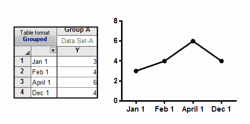
You'll need to use a different approach to plot a series of dates that are not equally spaced. Enter the data onto an XY table. Enter the dates as row titles. Into the X column, enter the number of days since some starting point.

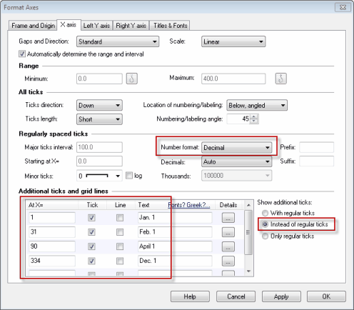
To make this graph, you'll need to make some changes on the Format Axis dialog. Leave the Number Format set to Decimal. Don't choose Row Titles, or you'll end up with an equally spaced graph. Use the Additional Ticks section to specify each label and its location (X coordinate). Check the option to plot only these additional ticks (instead of regular ticks).