What is a violin plot?
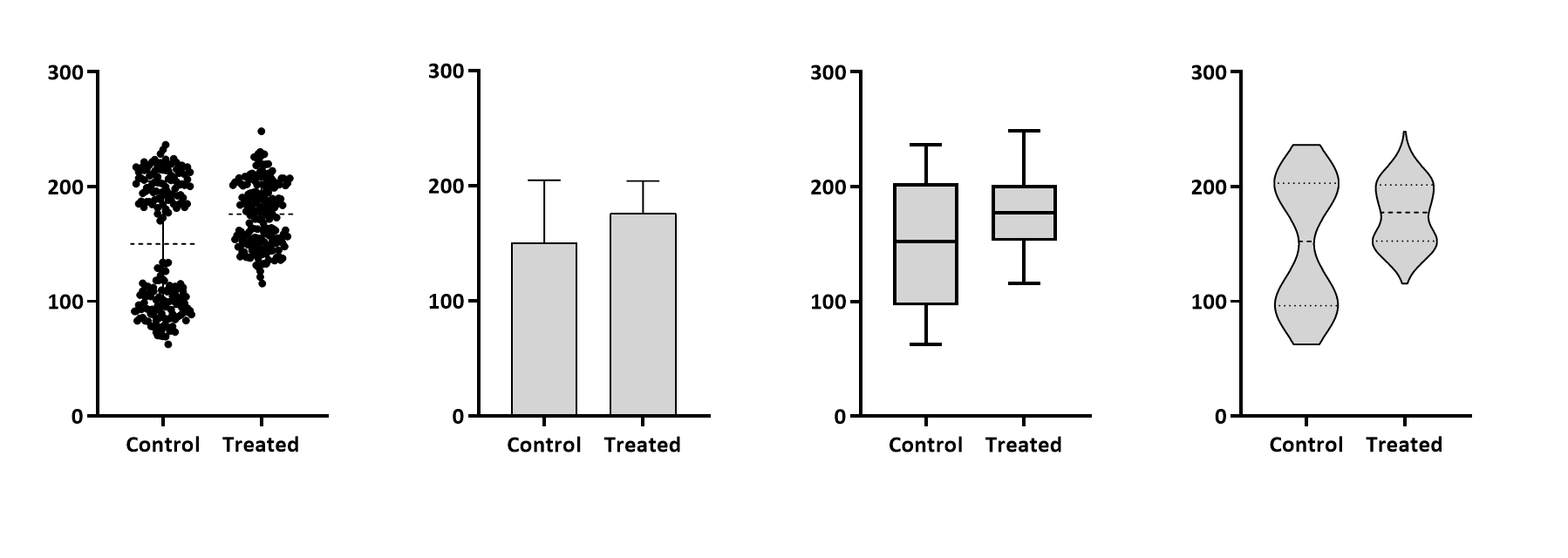
When you enter replicate values in side-by-side replicates in an XY or Grouped table, or stacked in a Column table, Prism can graph the data as a box-and-whisker plot or a violin plot. Violin plots show the frequency distribution of the data. The example below shows the actual data on the left, with too many points to really see them all, and a violin plot on the right. It gives the sense of the distribution, something neither bar graphs nor box-and-whisker plots do well for this example.
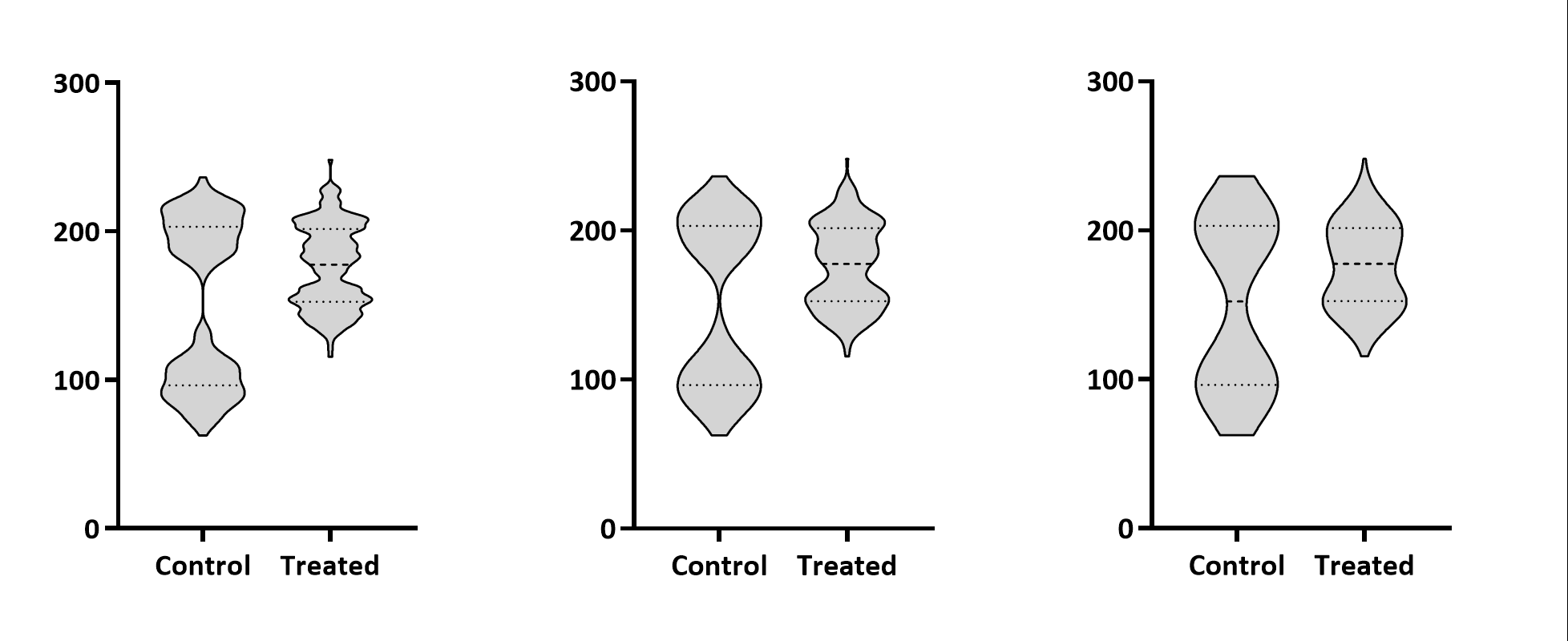
How smooth?
You decide (in the Format Graph dialog) how smooth you want the distribution to be. You have three choices shown below: Light (left), medium (middle), heavy (right). Light smoothing shows more details of the distribution; heavy smoothing gives a better idea of the overall distribution.
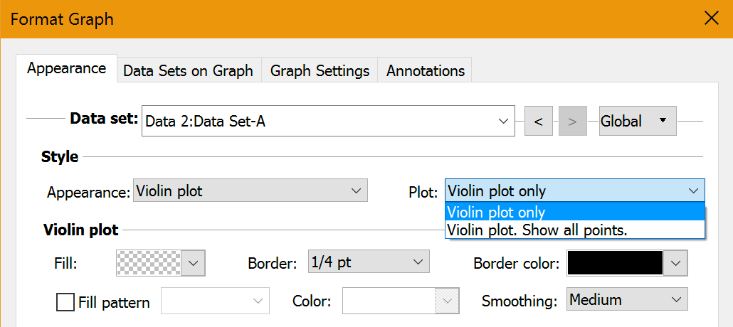
Showing individual points and violin plot
Prism lets you superimpose individual data points on the violin plot. This is not really helpful for displaying data. Why show both the data and a crude distribution? But it is very useful when exploring which level of smoothing to use. It is hard to assess the degree of smoothness of the violin plot if you can't see the data at the same time.
If you use small points the same color as the violin plot, the highest and lowest points won't be visible as they will be superimposed on the top and bottom caps of the violin plot itself. If you want to see these points, make them larger or a different color.
Notes
•Violin plots are new in Prism 8. They are a great way to show data. Use them!
•Surprisingly, the method (kernal density) that creates the frequency distribution curves usually results in a distribution that extends above the largest value and extends below the smallest value. As violin plots are meant to show the empirical distribution of the data, Prism (like most programs) does not extend the distribution above the highest data value or below the smallest. That is why violin plots usually seem cut-off (flat) at the top and bottom.
•In addition to showing the distribution, Prism plots lines at the median and quartiles. Separately specify the pattern (dotted, dashed..), color and thickness for the median line and for the two quartile lines.
•You can choose to fill within the violin plot, as the example shows.
•Violin plots show the median and quartiles, as box-and-whisker plots do. But violin plots do a much better job of showing the distribution of the values. Consider always using violin plots instead of box-and-whisker plots.