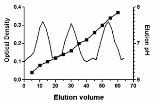
When you plot several kinds of data on one graph, it is often useful to plot some data using a Y-axis on the left side of the graph and other data using a Y-axis on the right side of the graph. Note that you never can have more than one X-axis.
To create a second Y axis
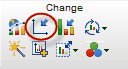
Double-click on an axis to open the Frame and Origin tab of the Format Axes dialog. Or click on the Format Axis tool in the Prism toolbar.
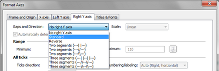
Select the tab for "Right Y axis" and choose how you want the axis to be formatted.
All data sets are initially graphed using the left Y-axis. Depending on the scale of the axis, the data points may or may not all be visible.
To plot data using the right Y-axis
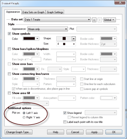
Double-click on a data point or click on the Format Graph button on the Prism toolbar. At the bottom of the Appearance tab, select “Right Y axis”. Repeat for each data set to be plotted on the right Y-axis.
If you assign a data set to the right Y-axis, and there is no Y axis. Prism will automatically create the axis.
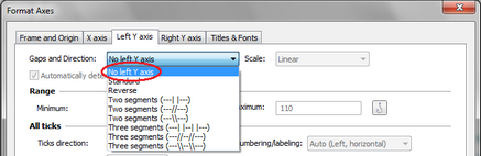
To create a graph with ONLY a right Y axis
Turn off the left Y axis, and create a right Y axis to which you assign data set.
To use different colors for the two Y axes
It is possible to give the two Y axes different colors. Select one axis, drop the Change menu, choose Selected Object(s), and set the color (and thickness) on the Format Object dialog that appears.
To create a graph with three Y-axes
Prism does not allow three Y-axes. You can, however, create that effect with a bit of a workaround. Create a graph with no data. Hide the X-axis (one of the choices for axis frame). Delete all the titles, You are left with just a Y-axis. You can make that whatever scale makes sense. Now make a layout and put your real graph next to this bogus graph with only a Y axis. With some fussing to get the sizes to match, and the data scaled right, you can give the illusion you want. You'll need to tell Prism to plot all the data sets on either the right or left axis, so may need to transform your values to make this work well.
This FAQ explains in more detail.
Limitations
Prism always draws the right Y axis, if there is one, the same length as the left axis and starting and stopping at the same position on the page. If you want one of the axes to be shorter, the only way to get that effect is to cover up part of one of the axes with a drawn rectangle that you then make white (or whatever your page background color is).