
Graph tip - Can Prism plot two X axes or three Y-axes?
Two X axes
How to do it:
Prism does not allow a single graph to have two X axes or three Y axes.
You can, however, create that effect with a bit of a workaround.
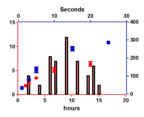
Create two graphs. On one, set the origin of the graph to be the upper right, To do this double-click on either axis and go to the Frame and Origin tab of the Format Graph dialog.
Create a second graph and set its origin in the lower left.
Then create a layout and drag both graphs onto the same layout sheet. You can pull and stretch them until they look like one graph. You can also click once to select one of the graphs, then use the keyboard arrow keys to nudge pixel by pixel until you get the perfect alignment.
Three Y axes
General comments
First, ask whether you really really want three Y axes. These kinds of graphs are hard to read. Alternatives include stacking three graphs on a layout or transforming all data to percent-of-control or some other normalized scale that makes all the data sets be on the same scale.
If you really really want three axes and are willing to be a bit sneaky to make it happen, read on...
Approach 1. Requires some math (transforms)
Create a graph with all of your data sets. Double-click on any data point to open the Format Graph dialog. Click the Right Y axis tab to create a Y axis and assign one of your data sets to it.
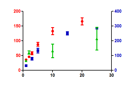
Create a graph with no data. Hide the X axis (one of the choices for axis frame). Delete all the titles, You are left with just a Y axis. You can make that whatever scale makes sense.
Now make a layout and put your real graph next to this bogus graph with only a Y axis. With some fussing to get the sizes to match, and the data scaled right, you can give the illusion you want.
Note the problem. You'll need to tell Prism to plot each data set on either the right or left axis, and cannot tell Prism to plot on the third axes. So you will probably need to transform the values you plot on that axis to make this work well. Enter or transform the data to the scale matching either the left or right axis. But then set things up so the third axis shows the real value. This will take some math and some fussing, but is quite possible. In the end, Prism "thinks" the data are plotted on the right or left axis, but readers see the data as plotted on the third axis.
.png)
Once you've created such a graph (layout), you can use it as a template. Open the file, enter new data, and the graph will update automatically.
Download this file to see how this graph was made.
Approach 2. More fussing but less math
This file shows an alternative way to create the appearance of a third Y-axis, without any transformations. The idea is to first create a graph for the data plotted on left and right Y axes. Then create a graph that only plots the third data set (in its own units, no transforming needed). Duplicate that graph. On one copy, hide both Y axes, but leave the data. On the other copy, remove the data and the X axis, leaving only the new Y axes. Now combine all three graphs on a layout. It works. The notes in the file explain how it works. This method was devised by Nishanth Makthal and Hackwon Do (Houston Methodist Research Institute).
Keywords: superimpose layout axes