What is projection?
For datasets with a large number of variables, dimensionality reduction is needed in order to more easily understand the relationships within the data, or to generate models from the data that can be used for reliable prediction of future observations. One method to achieve dimensionality reduction is through a process known as “projection”. Fortunately, we’re all familiar with this concept even if we’re not familiar with its name.
In the previous section, we considered the use of “3D” graphs to display data along three separate dimensions (three variables used as perpendicular axes). The thing about these “3D” graphs, however, is that they do not actually include three perpendicular axes, but only represent three axes. These graphs are presented on a piece of paper or a computer monitor, each of which are flat and only have two dimensions (length and width, but no depth). These “3D” graphs only appear to have a third spatial dimension, when in reality they have only two. This may seem like an obvious point, but it is an important concept related to dimensionality reduction.
What’s actually happening with these “3D” graphs is that the information that is described by three dimensions (three variables) is being projected into two-dimensional space. Fortunately, our (human) brains are very good at interpreting projections of three-dimensional data into two dimensions. Whenever we see a photograph or watch a movie, we’re interpreting the two-dimensional projection of three-dimensional information, and we do a pretty good job of understanding the implied information about “depth” in these images even though there isn’t any.
Projection onto the axes
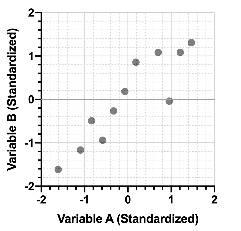
To make the rest of the concepts in this section a bit easier to understand, let’s consider the simple dataset consisting of only two variables (Variable A and B from before). Here’s the data again:
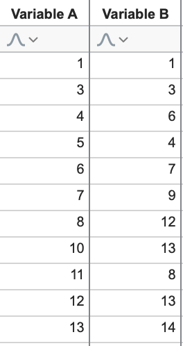
Let’s look at an example of projection using a (two dimensional) graph:
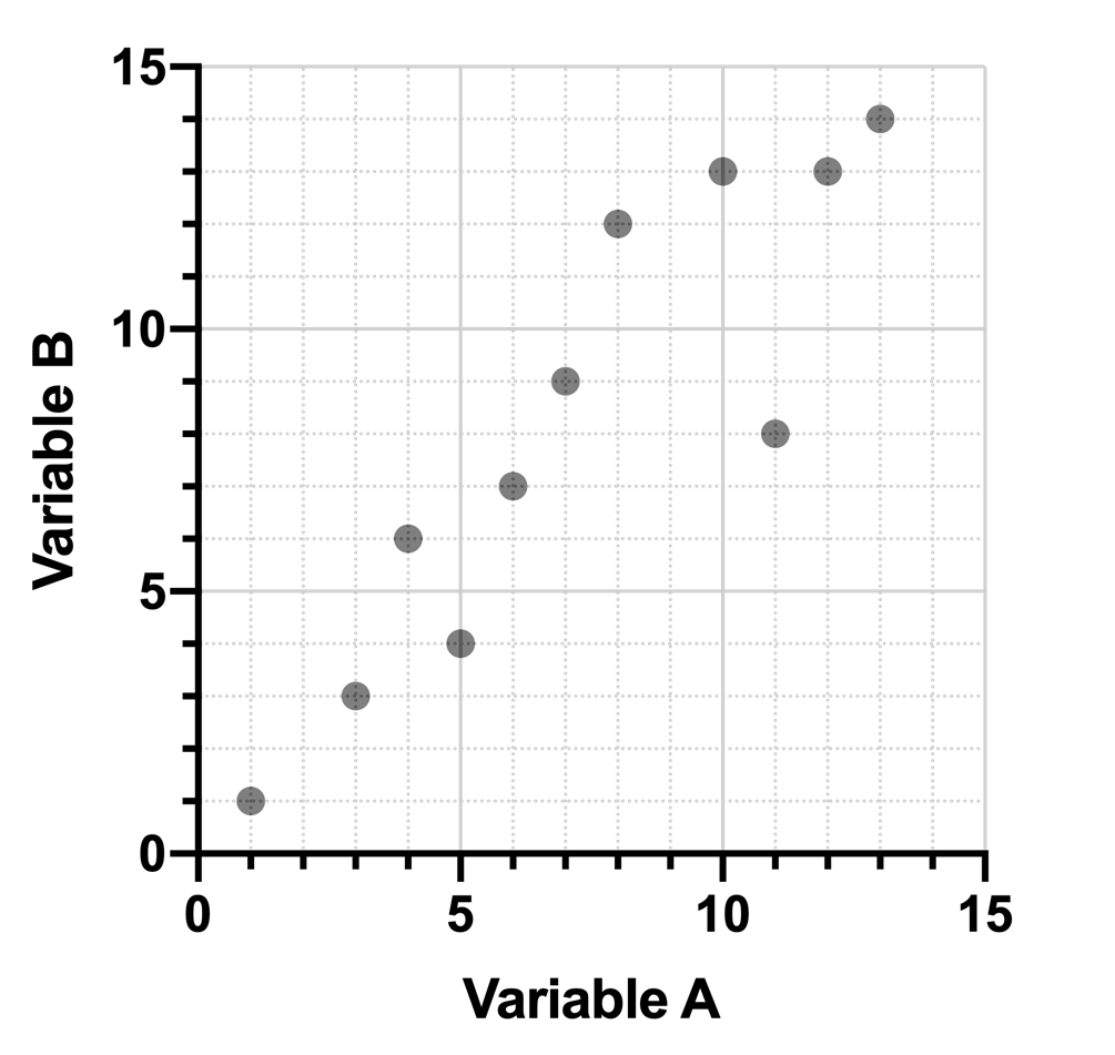
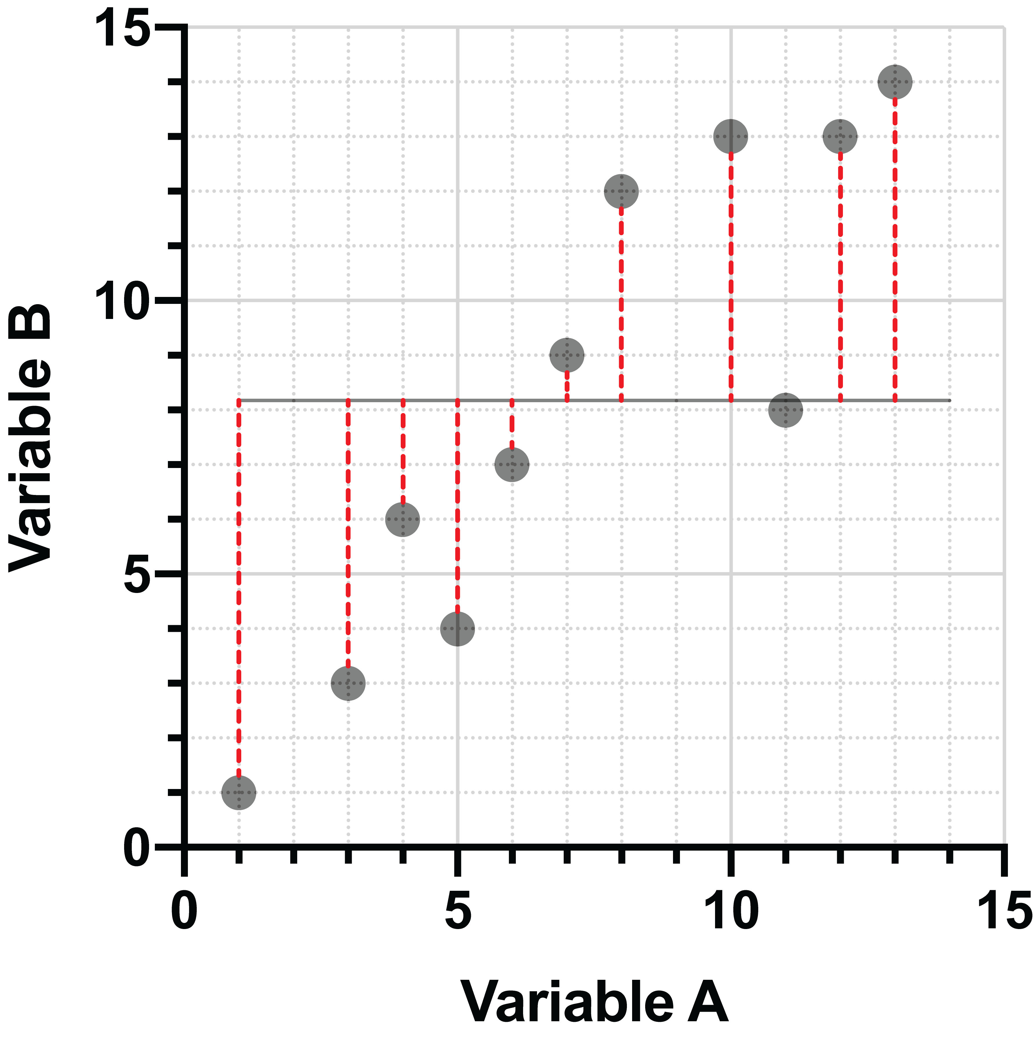
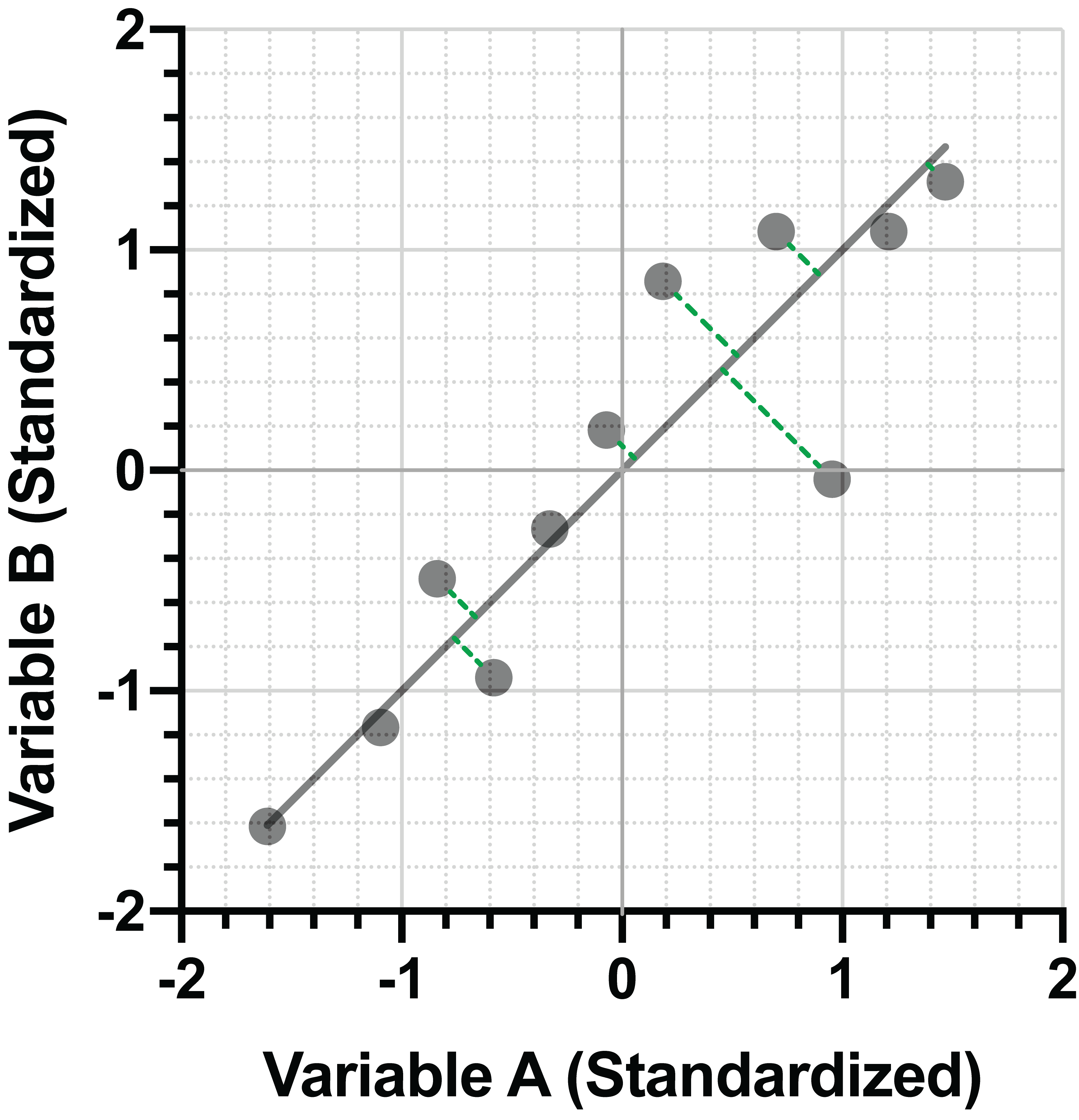
This is the graph of two of our variables in the dataset above. Projecting the data onto the X axis (Variable A) might look something like this:
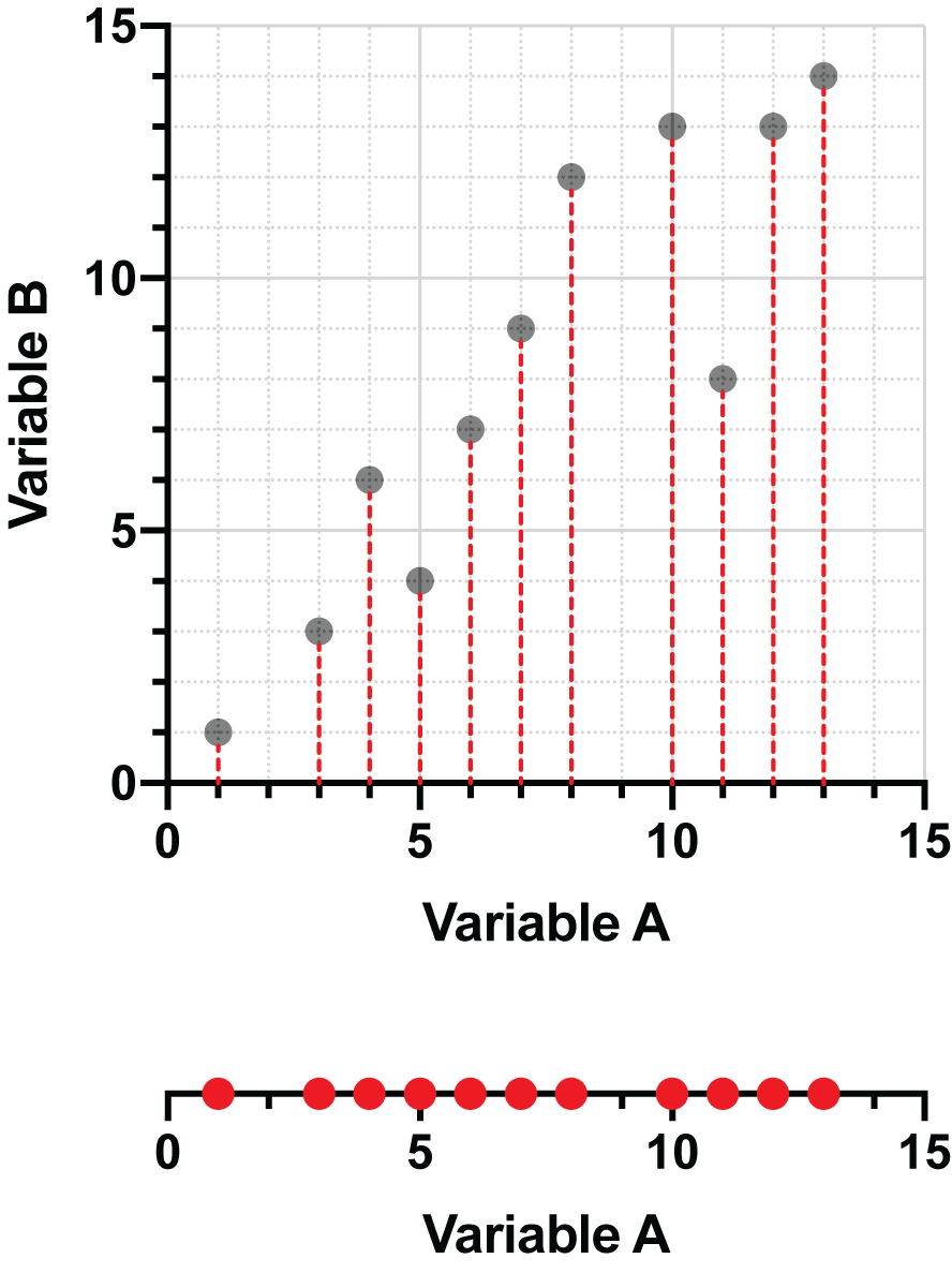
If we chose to instead project the data points onto the Y axis (Variable B), we would end up with a graph such as this:
You may have realized that by performing these projections, we reduce the number of dimensions required to describe the data. In the first example, we only need the values of Variable A and can represent this projected data as a simple number line. In the second example, it’s the values of Variable B that we end up with, and we can again present these values on a single number line (rotated to be easier to read).
Projection onto other lines
Projecting the data onto one or the other axes shows how fewer dimensions are needed to describe the data. However, it also shows that a substantial amount of information is lost with either approach. When projecting onto Variable A (the X axis), information about Variable B is lost, and vice versa. Often, we are interested in minimizing the amount of information lost during the process of projection. As such, there are other methods of projection that retain information about both variables, one of which is probably quite familiar.
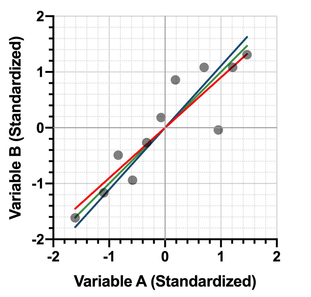
Linear regression is an extremely common method of projecting points onto a line. Generally, the regression is performed in such a way that the sum of squared vertical distances between the points and the line are minimized. Consider the following two graphs:
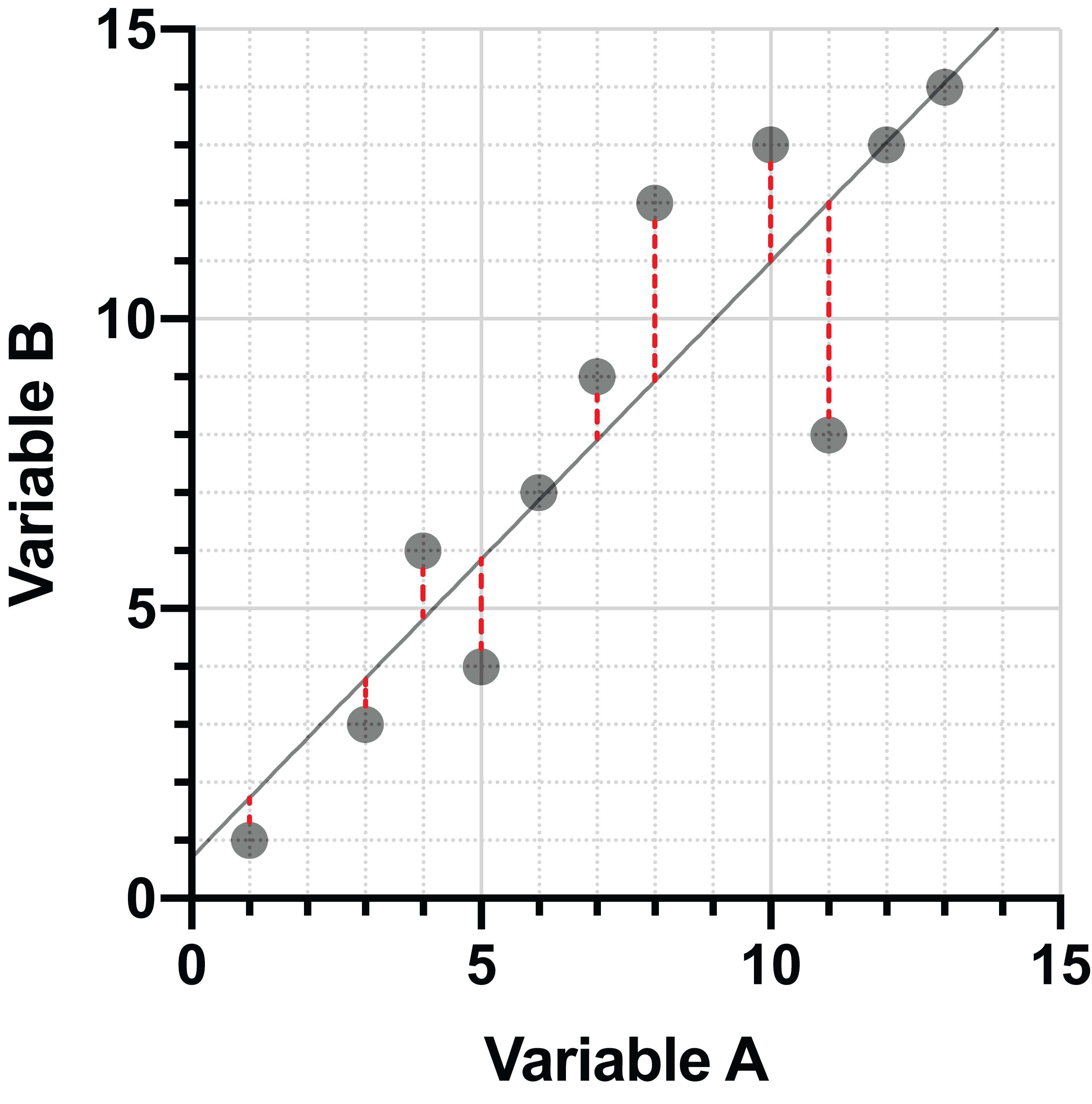
On the left, the points are projected onto a poorly fitting line with large vertical distances between the points and the line. On the right, the vertical distances have been minimized, and this is the best-fit line for this data.
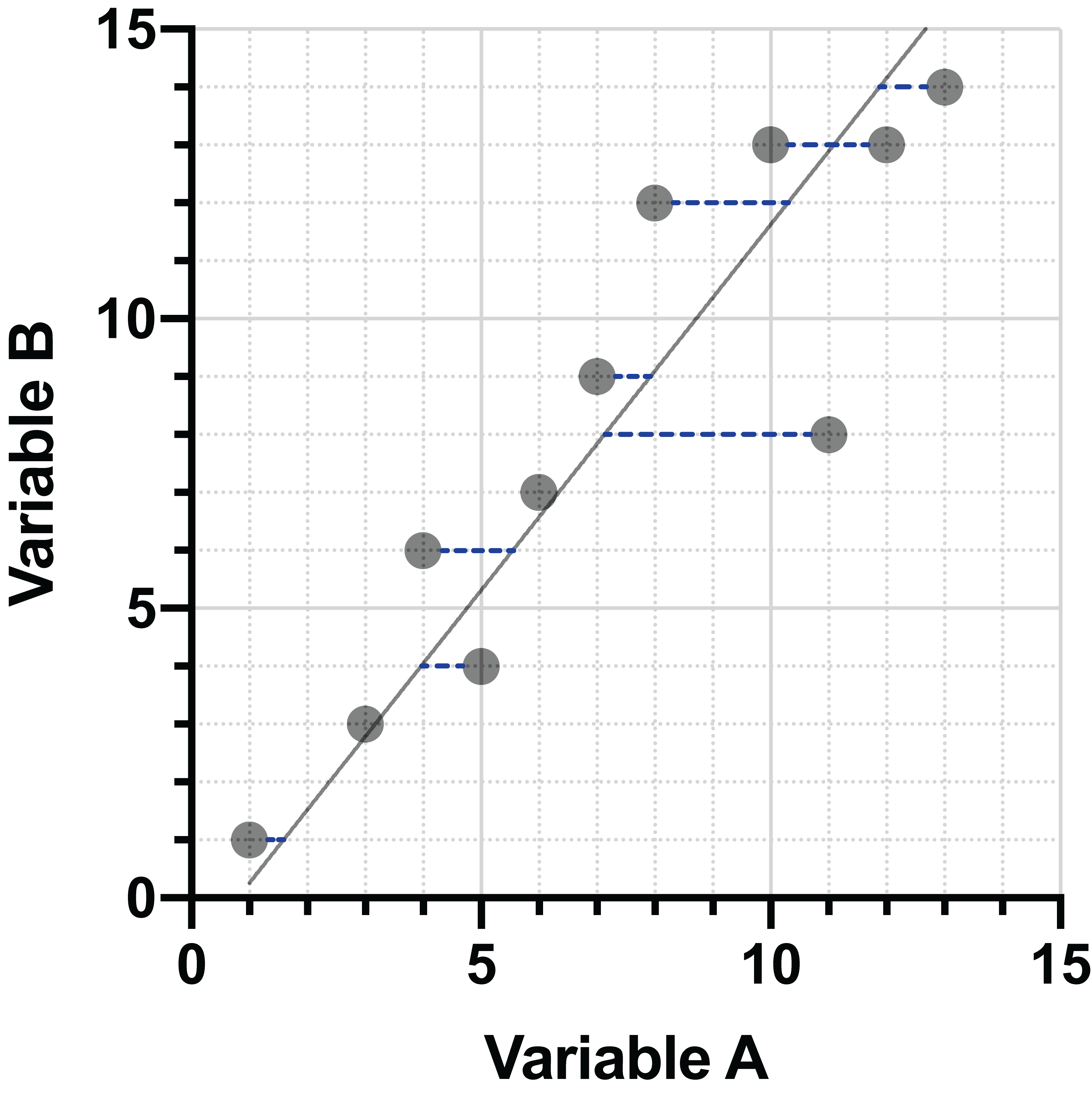
In standard regression, the data are projected in the Y direction (vertically) to the line, and these distances are minimized. However, other techniques can be used for projection of the data. For example, projection in the X direction (horizontally). Minimization of these distances generates a slightly different line:
One additional approach for projection of data onto a line is to minimize the distances in both directions simultaneously. We’re going to use the same data as before, but we’re going to apply some transformations to it before moving forward. These transformations will not only give you a good visual representation of how this last projection method compares to the other two, but they are also important when performing PCA due to the way that the principal components are defined. This is discussed in greater detail in a separate section.
Here’s our original data once again:
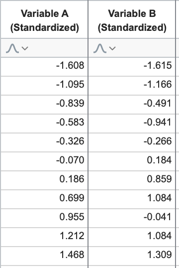
We’re going to standardize this data. To do this, we first calculate the mean and standard deviation for each variable. Then, for each value within a variable, subtract that variable’s mean and divide by its standard deviation (this is also sometimes referred to as a value’s Z score). For this data, standardization would result in the following (rounded) values:
One important fact to note about variables that have been standardized, they will always have a mean of 0 and a standard deviation of 1. Let’s take a look at these standardized data on a graph.
Overall, the graph of the standardized data looks very similar to the graph of the original data, but shifted so that the “center” of the point cloud lies at the origin (0,0). Note that the scale of the data in both the X and Y directions was also changed, but because the standard deviation of both groups was similar (3.90 for Variable A and 4.45 for Variable B) the overall shape of the scatterplot hasn’t changed much.
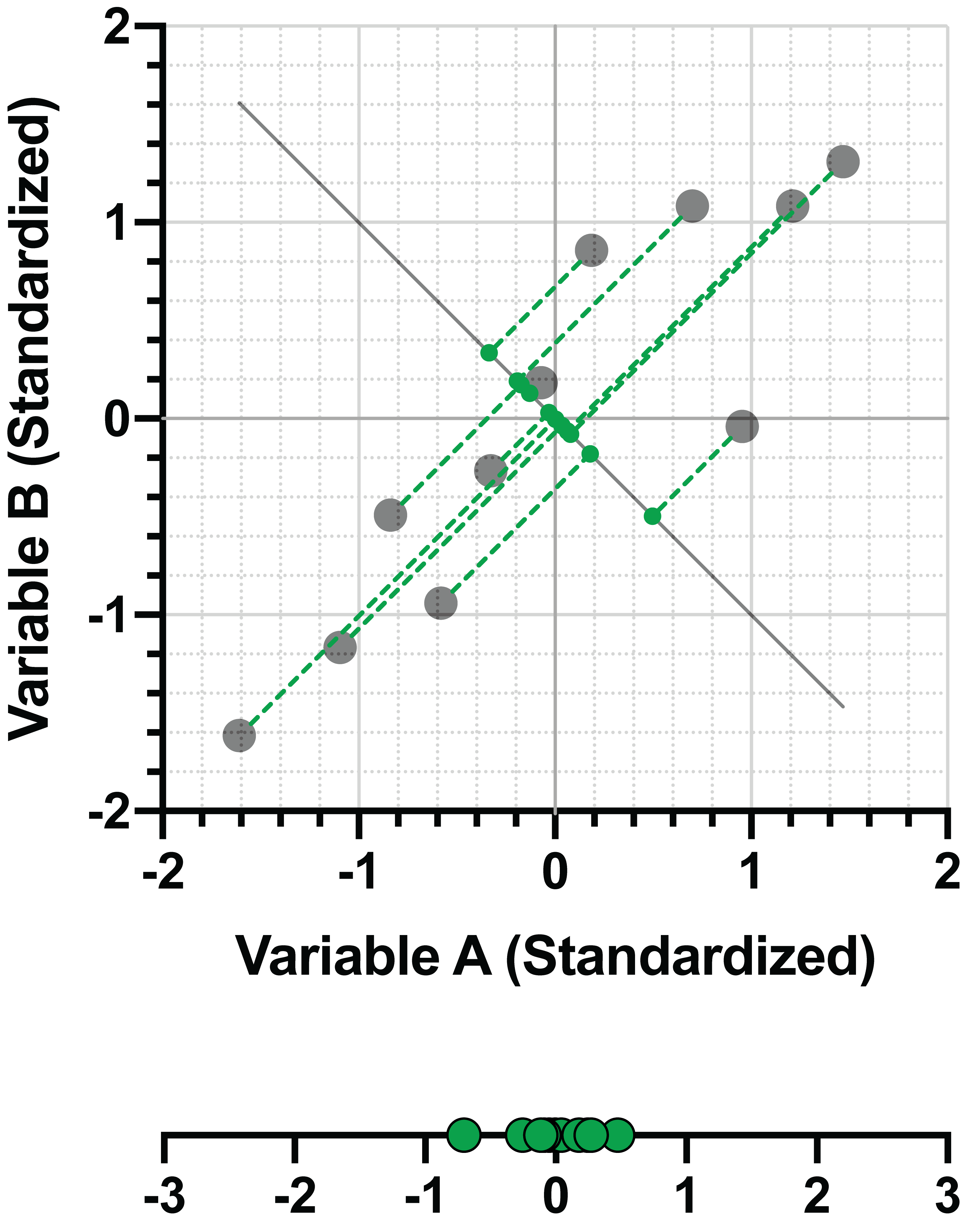
Using the standardized data, let’s now look at how we might project these points onto a line where we minimize both the horizontal and vertical distances between the points and the line simultaneously. Because we standardized the data (i.e. the variance in the X and Y directions are the same), this is the same as minimizing the perpendicular distance between the points and the line:
If we compare this line to the lines fit using minimization of vertical (red) or horizontal (blue) distances between the points and the line, we see that minimization of the perpendicular (green) distance lies directly in the middle:
The Payoff
So why did we go through all of this business about projecting data and the different lines that can be used for projection? As it turns out, when using standardized data, fitting a line to the standardized data by minimizing the perpendicular distance between the points and the line also maximizes the variance of the projected data on the fit line. This means that using this process simultaneously:
•Minimizes the amount of information lost due to projection of the data onto the line
•Maximizes the amount of variance of the projected data on the line
One more graphical comparison to make this more clear. Here again is the projection onto the line fit by minimizing the perpendicular distance between the standardized data points and the line:
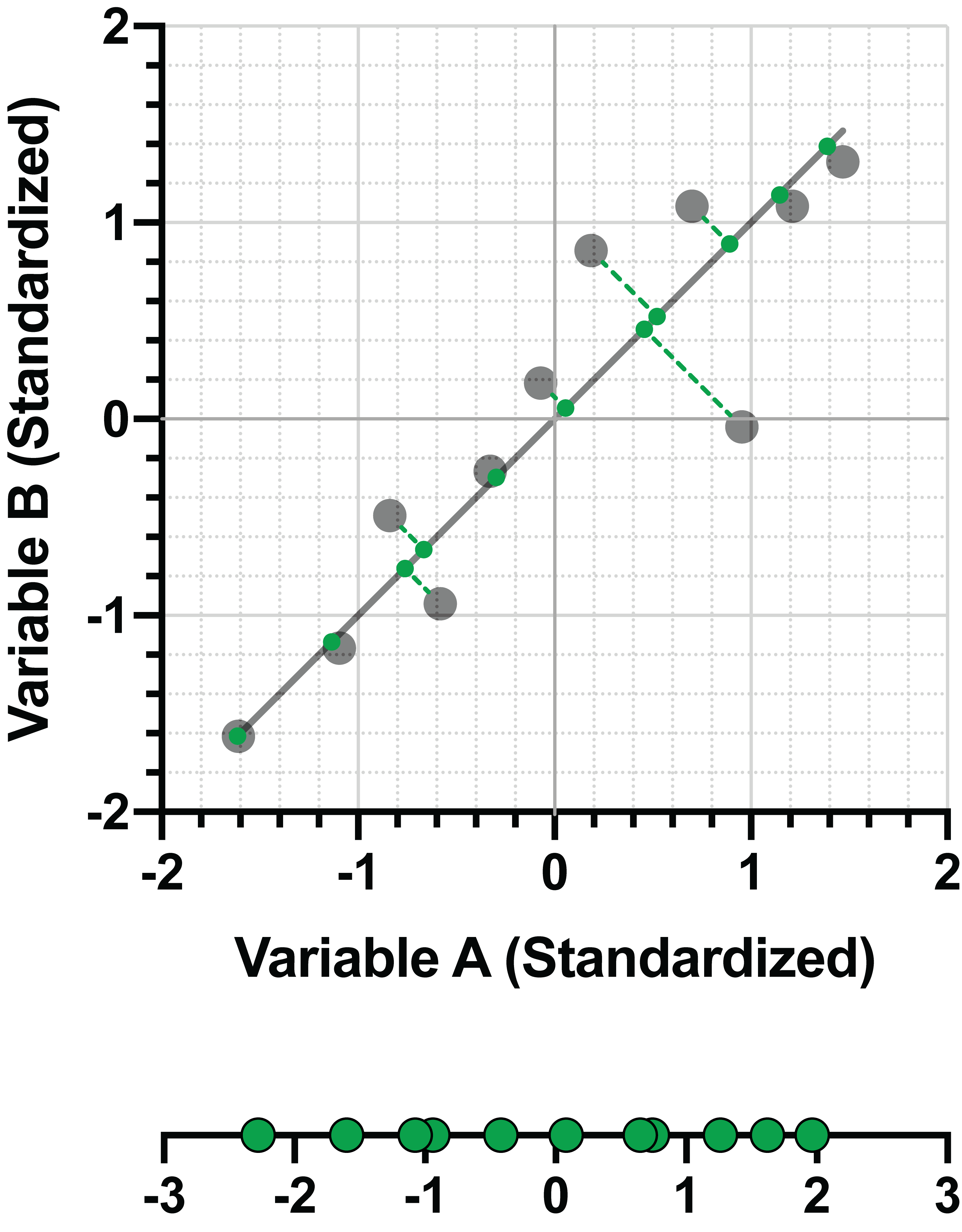
Now compare the variance (spread) of the same data, perpendicularly projected onto a different line:
In this second graph, it’s fairly clear that the distances between the points and the line are much greater than in the previous graph, AND the projected data are much more closely clustered on the line. Surprisingly, it turns out that minimizing the perpendicular distance between the data points and the line is equivalent to maximizing the variance of the projected data on the line. More importantly, this is exactly what PCA is trying to do: to explain the most amount of variance in the data by projecting the data onto a smaller number of dimensions. PCA, of course, does this when you have many variables. There really is no need for dimension reduction when you only have two variables.