Graphics are generally the most important results from PCA unless you plan to use the PC scores for further analysis. Graphs generated by PCA include:
Score plot
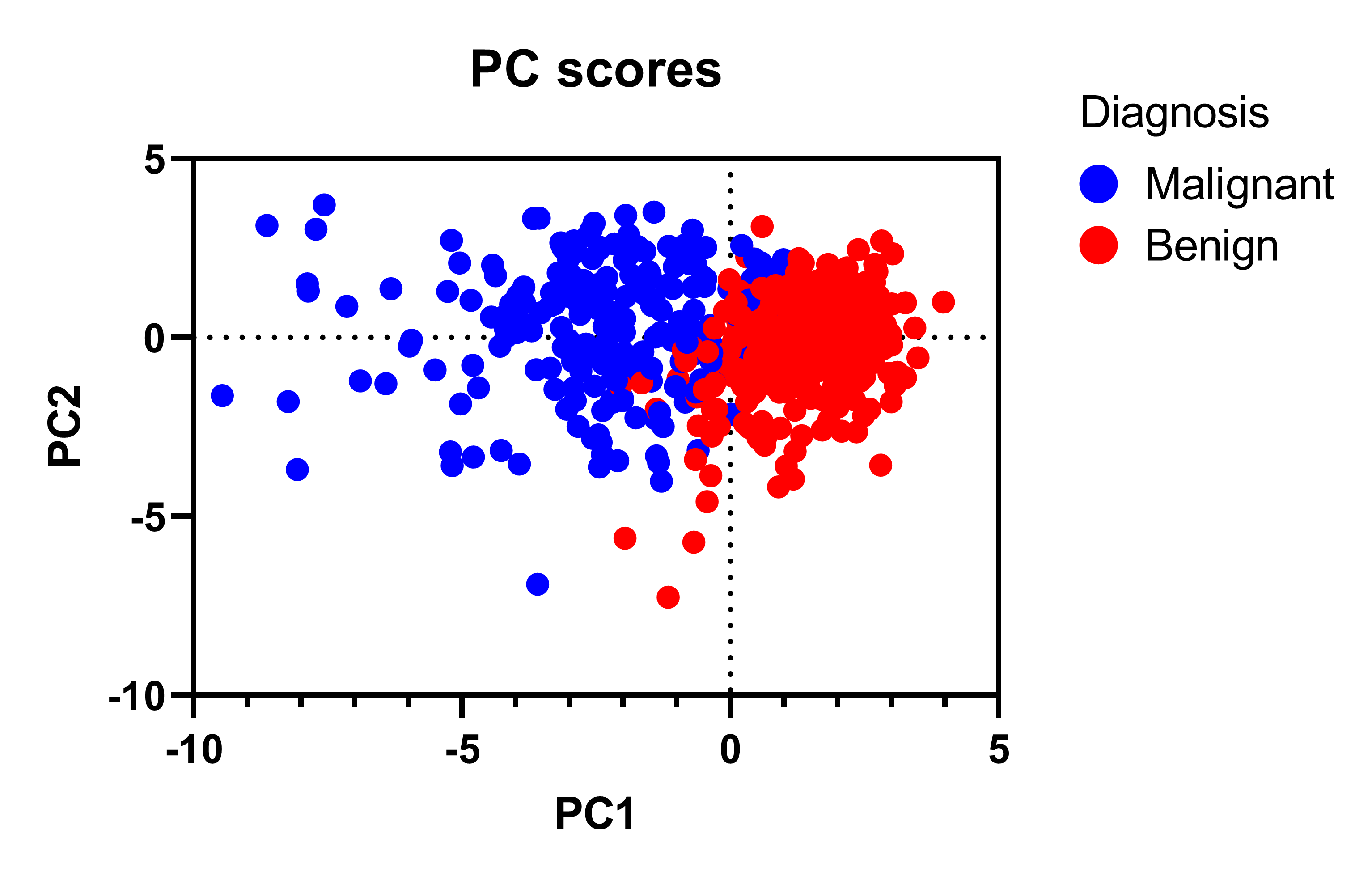
PC scores are used to plot the rows of your data along the chosen principal component axes. These plots offer a low dimension representation of your data. It’s primarily useful for clustering or deriving some other meaning based on where certain points appear in relation to the others along the two selected components. In Prism, you can hover your cursor over points of interest to get links to that associated row or column in the data table.
The underlying graphic in Prism that does this plot is the Bubble Plot, and it’s very flexible.
The Format Graph dialog can be accessed by using the button in the toolbar ( ) or by double clicking anywhere in the graphing area (except for on the axes). This allows you to customize a number of graphical features including:
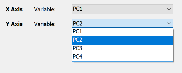
•Changing which PC is plotted on each axis using the Axis Variables section of the dialog
•The symbol color, size, and border
•Labels
•Legends
•Much more
Loadings plot
The loadings plot simply plots the numerical values from the Loadings matrix of the specified principal components.
Somewhat analogous to how the PC scores plot depicts the rows of data (rotated along the PCs), the loadings plot provides information about the columns. The loadings are the correlation (or covariance) between the columns of data and the PCs. This plot is useful for identifying clusters of variables.
In the plot below from the breast cancer sample data included in Prism, we see that all the columns appear on the left hand side. That means that the first principal component has a negative value for all the loadings. The negative value has no interpretation, but because all the variables are on one side means that each variable correlates with the first PC in the same direction, namely as the variable goes up, the PC1 score goes down.
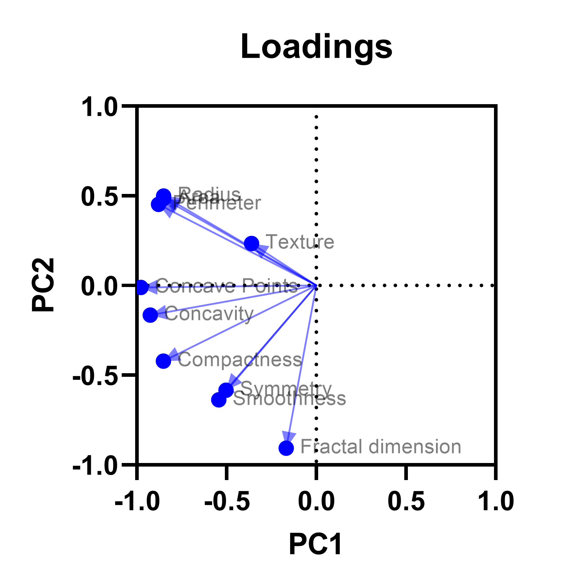
Similarly, variables that appear close together on the plot (such as symmetry and smoothness, or radius and perimeter) indicate clusters along the first two PCs. If we decide that the first two PCs explain the majority of variance in the original variables, then we could conclude that variables which are clustered on this graph are recording largely redundant information. In that case, we might only measure one of these variables for future studies.
Biplot
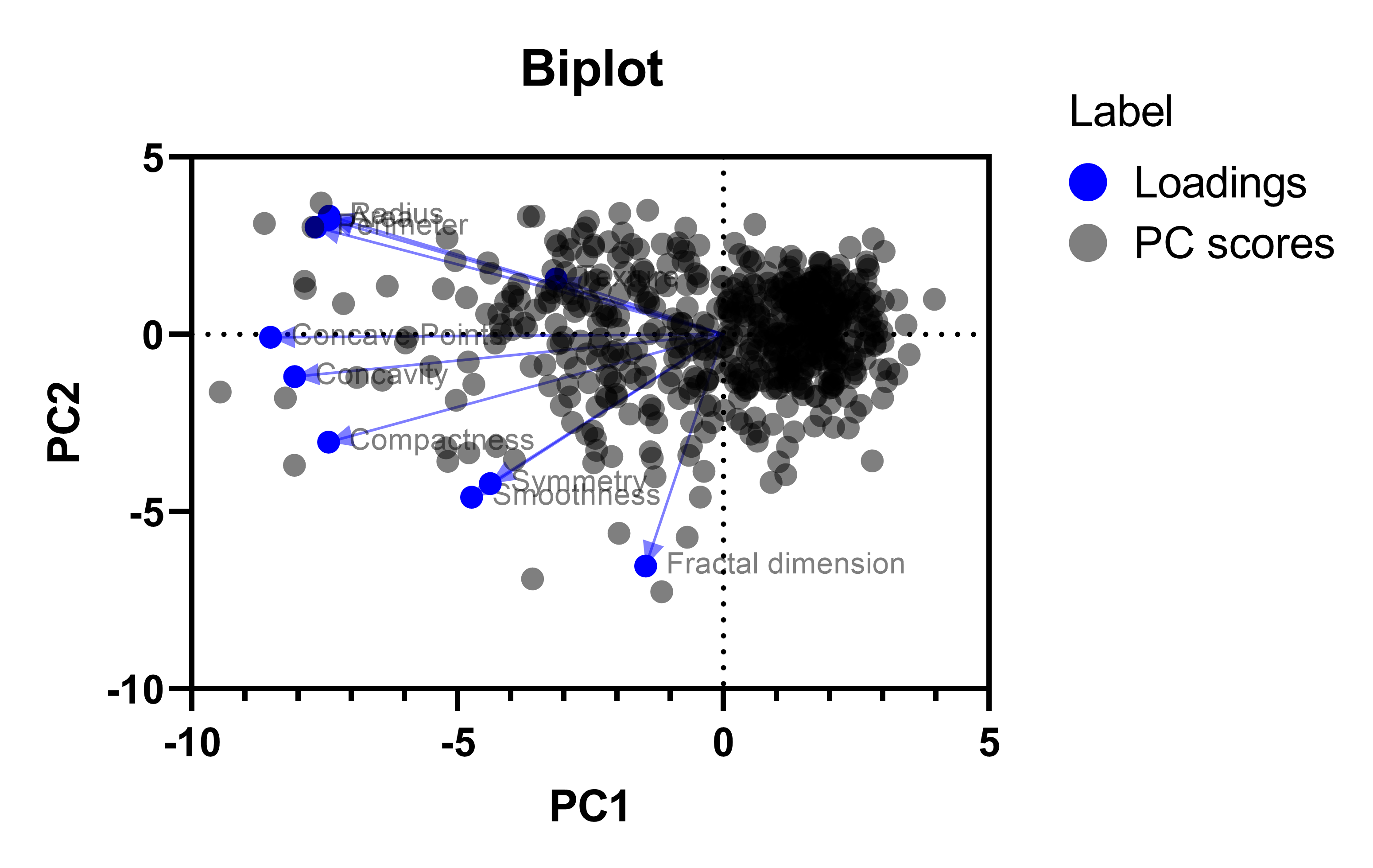
Biplots scale the loadings by a multiplier so that the PC scores and loadings can be plotted on the same graphic. They are common graphics for PCA, so we included the functionality, but we prefer plotting the loadings and PC scores separately in most cases.
Scree plot
Scree plots were traditionally used for determining the number of principal components to include during PCA. They are named after the shape of slopes that occur naturally from scree, which are the fallen rocks that accumulate at the base of cliffs.
To select the number of PCs using the scree plot (not recommended), visually determine the point where the eigenvalues end their steep descent and begin to level out. Retain all of the PCs along the curve before it begins to flatten out, but do not include the PC where the curve changes from "steep" to "flat". In this case, we would keep only the first two principal components.

As shown, the Eigenvalues for each of the PCs is also given on the scree plot. Depending on the PC selection method chosen on the Options tab of the PCA parameters dialog, the scree plot may also be modified with additional information.
Parallel analysis
If you choose parallel analysis as the method to select which PCs to retain, Prism will include the simulated eigenvalues from this analysis on the scree plot.

Selection based on Eigenvalues
If you choose to use the "Kaiser rule" (not recommended) or to specify your own Eigenvalue threshold (not recommended), Prism will include a horizontal line on the scree plot indicating this threshold.

Proportion of variance plot
The proportion of variance plot is similar to the scree plot, but instead of plotting the eigenvalues, it plots the proportion of variance explained by each PC. This proportion of variance is equal to the Eigenvalue for that PC divided by the sum of Eigenvalues for all PCs (reported as a percent). It also includes a bar chart of the cumulative total. For example, the plot below indicates that the first two PCs explain just about 80% of the total variance within the input variables.
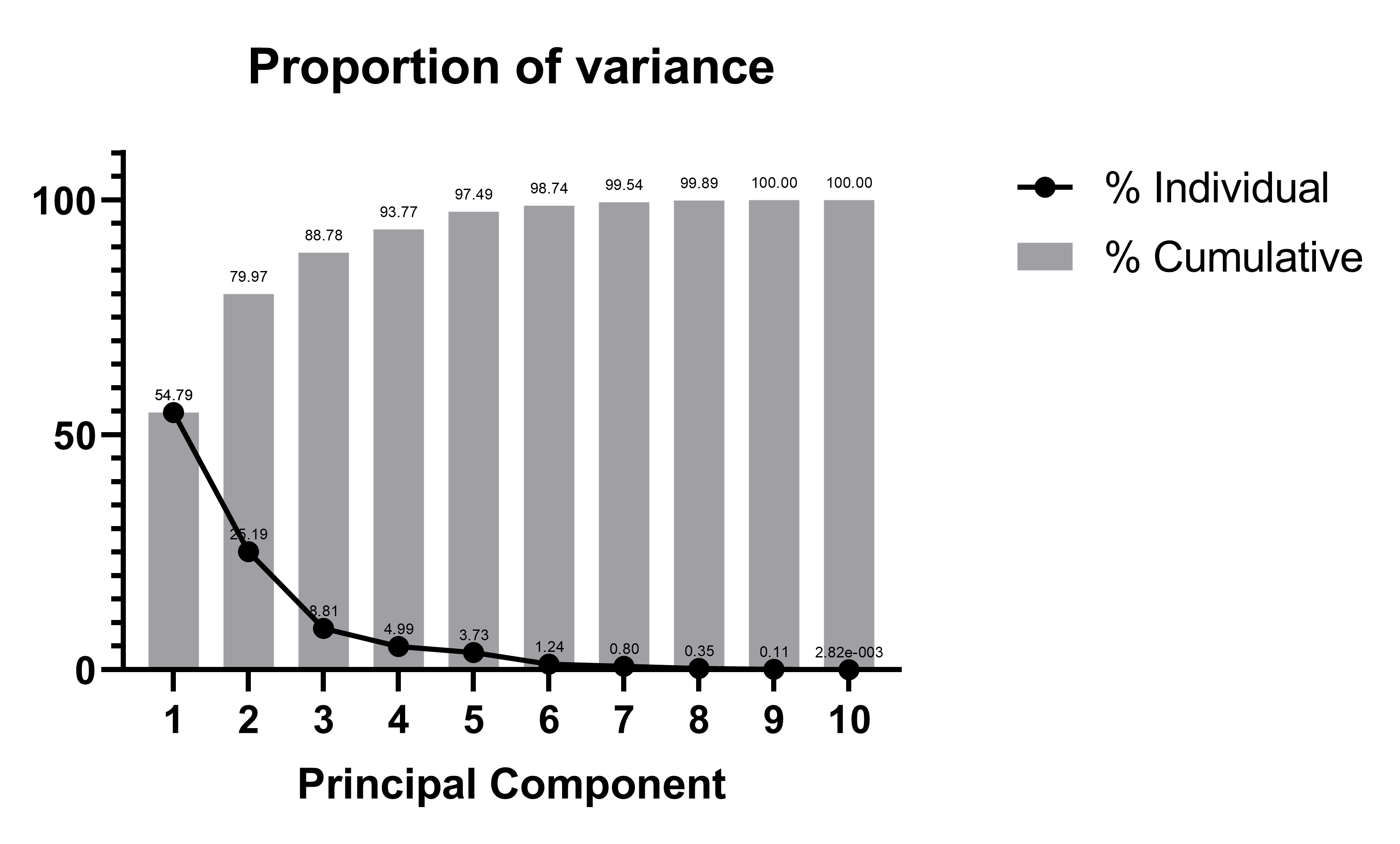
The proportion of variance plot may also include additional information about the analysis depending on the PC selection method chosen on the Options tab of the PCA parameters dialog.
Selection based on percent of total explained variance
If you choose to select PCs by setting a threshold for total explained variance (commonly 75% or 80% of total explained variance), Prism will include a horizontal line on the proportion of variance plot indicating this threshold. Below is an example where the threshold was set to 75%.
