Format Graph dialog - Grouped graphs
Use this dialog to change the look of all the columns in a data set. If you want to change the look of a single column, use the right-click menu. You can also change all the symbols in selected data sets.
Double-click on any graph symbol or bar to open the Format Graph dialog.
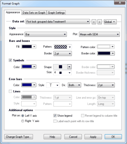
To change the settings for one data set:
Select a data set from the list, and choose the symbols, lines, and error bars for that data set. Then select another data set and choose settings for that data set. Click OK to redraw the graph with all the changes. Note that a fitted curve is treated as a separate data set.
To change all data sets on the graph (for example to make all symbols larger):
Click the Global button and choose, Change all data sets. Changes you make after that will then apply to all data sets.
Style
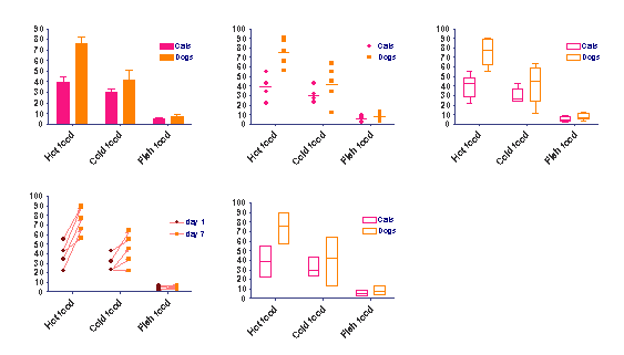
With two-grouping variable graphs, replicates are placed in side-by-side columns on the data table. One grouping variable is the main column heading, the other is the row title.

Choose how to display a data set on the graph. Choose between a scatter dot plot, an aligned dot plot, a before-and-after plot, a column or bar, a box-and whiskers plot, or a floating bar showing the minimum and maximum.
Choose how to plot error bars. Select SD, SEM, 95% CI, or range. Your style choice will determine which options below you can use. Since it rarely makes sense to choose different error bar (or replicate) choices for different data sets, you will probably want to click "All" before changing error bar format.
Format Symbols or bars
If you choose to plot data as a scatter dot plot or a before-and-after graph, select the symbol type, size, and color. If you pick an open symbol, also select a border thickness. Check the Clear option if you want point-to-point lines and overlapping points to show through the open symbol.
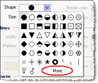
Click More to use any character from any font as a symbol.
If you choose to plot your data sets as bars, columns, box-and-whiskers, or floating min/max boxes, choose the color, outline and fill of the bars and boxes.
Use the Data Sets on Graph tab to adjust the spacing between bars, and whether you want the bars stacked, interleave, grouped, or superimposed.
Prism labels bars with the row titles from the data table. You may not edit the bar titles directly, but if you edit the row titles, the graph will update. Use the Format Axes dialog, not the Format Graph dialog, to turn off the labels or to change to vertical or angled labels.
If your data table has only one row, Prism will place the column titles, rather than row titles, under each bar.
Format error bars
Choose the format and color of error bars. Learn more about error bars on Grouped graphs.
Lines
Choose the format of lines connecting data points for a before-and-after plot. Consider using arrows.
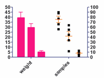
Plot on which Y axis
Specify which axis to use for each data set. If you choose to plot on the right Y-axis, Prism will create that axis if it doesn’t already exist.
Legend
Select Show legend to create a legend for this data set. Prism automatically uses the column titles in your data table as legend labels. You can also edit the labels in the legend. Double-click on the legend text and type whatever you like. Use the "Revert Legend to Column Titles" checkbox in the Legend section of the Format Graph dialog to change the labels back to match the column titles. (This checkbox is only available if you have edited a legend.)