Features and functionality described on this page are available with our new Pro and Enterprise plans. Learn More... |
The most familiar output of hierarchical clustering is easily its visual representation in the form of heatmaps and dendrograms. This tab of the analysis parameters allows you to specify which graphs you would like to generate as part of the output of the analysis.
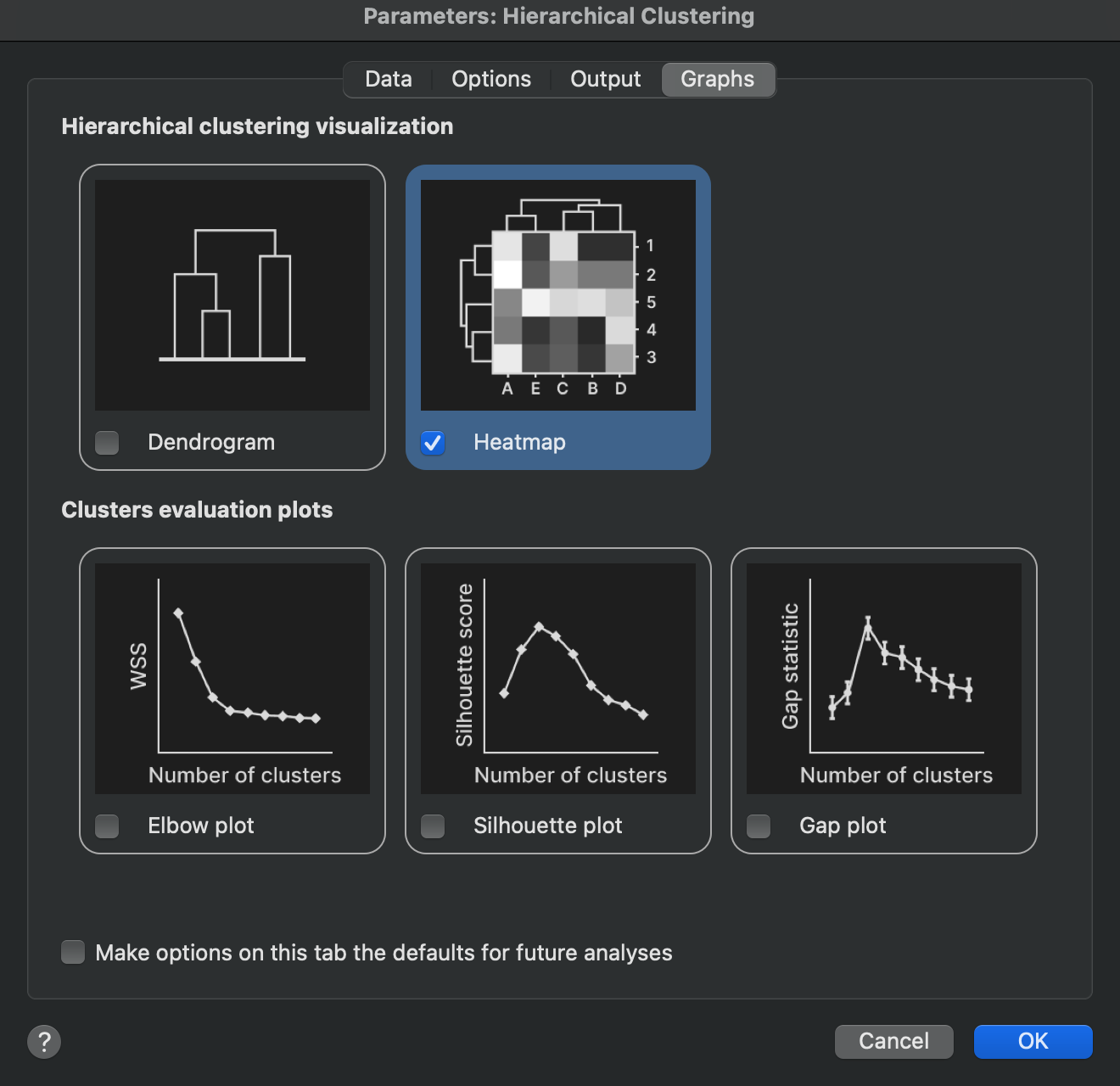
Visualizing hierarchical clustering results
Dendrogram
Enabling this option will create “standalone” dendrograms representing clustering performed on rows or columns (depending on the clustering direction selected on the data tab of the analysis parameters dialog). If you chose to specify a number of clusters or cut height on the Options tab of the analysis parameters dialog, this information will be presented on the dendrogram as different color branches for each specified cluster.
Heat map
Enabling this option will create a heat map of the scaled data (if appropriate based on the scaling options selected on the Options tab of the analysis parameters dialog), along with dendrograms aligned to the rows or columns of the heat map (depending on the clustering direction selected on the data tab of the analysis parameters dialog). If you chose to specify a number of clusters or cut height on the Options tab of the analysis parameters dialog, this information will be presented on the dendrogram as different color branches for each specified cluster. Note that the color schemes will be applied to the row and column dendrograms independently if both are shown on the heat map
Graphs to help evaluate optimal cluster selection
One challenge of performing hierarchical clustering is to know how many clusters to segment your data into. Theoretically, there could be as few as a single cluster in which all of your observations are grouped together. Alternatively, there could be as many as N-1 clusters (where N is the number of observations being clustered). At this extreme, only two observations were clustered together, while every other observation exists in its own cluster. Choosing N clusters (where N is the number of observations being clustered) is the same as not performing clustering at all, as each observation would belong to its own cluster.
So how do you choose the “best” number of clusters to group your observations into? There are a variety of ways to go about this, and Prism offers three common visual approaches. The elbow plot, the silhouette plot, and the gap statistic plot are all discussed briefly below, while more details around the math involved in these techniques can be found in other sections of this guide.
Elbow plot
Historically, this graph is very commonly reported alongside clustering analyses, and represents the “within cluster sum of squares” for each possible number of clusters (from a single cluster to N-1 clusters where N is the number of objects in the dataset being clustered). As the observations or objects are grouped into more and more clusters, the within cluster sum of squares will decrease. Typically, this value decreases rapidly as the number of clusters increases from 1. However, as the number of clusters grows, the decrease as each subsequent cluster is added starts to become smaller and smaller. This can be thought of as a problem of “diminishing returns” upon adding more clusters. The idea is to find a point where the error is no longer reduced substantially by adding another cluster. Visually, this occurs at the “elbow” of the curve (where the curve “bends” from decreasing sharply to a much more shallow decrease). However, in practice, evaluation of the “optimal” number of clusters from this method is highly subjective and largely unreliable. This graph is provided in order to remain consistent with results generated by most other packages. That said, this graph is often not considered to be extremely useful for accurate determination of the optimal number of clusters.
Silhouette plot
The idea of a silhouette plot is simple to explain without a lot of heavy math concepts. For any specific number of clusters, each observation will be assigned to only one cluster. The silhouette score for that observation is calculated by determining how close on average that observation is to other observations within the same cluster, and how close the observation is to all of the observations in the next nearest cluster. In a perfect scenario, you would expect that each observation would be very close to the other observations in its own cluster, and farther away from observations in different clusters. An ambiguous case might be when an observation is the same average distance away from the other observations in its own cluster as it is to the observations in the next nearest cluster.
The math details for how silhouette scores are calculated are provided on another page in this guide, but the following summary is provided here:
•Silhouette scores can be any value from -1 to 1
•A silhouette score close to 1 indicates that the observation is well matched with other observations in its cluster
•A silhouette score of 0 means that this observation is “on the border” of two different clusters
•A silhouette score of -1 means that an observation is very poorly matched with others in its cluster, and is actually more similar to observations in the next nearest cluster
For any number of specified clusters, a silhouette score can be calculated for each observation. Then, the average of all silhouette scores can be calculated. The silhouette plot that Prism reports shows the average silhouette score (on the Y axis) for each different possible number of clusters (on the X axis) from 1 to N-1 (where N is the number of observations). One approach for determining the “optimal” number of clusters for the analysis is to determine where the average silhouette score is the largest. This indicates that - on average - the observations were well matched with other observations in their assigned cluster.
Gap statistic plot
The general concept of the gap statistic plot is to investigate how well your data can be grouped into various numbers of clusters, and then compare how that compares to how well random data can be grouped into the same number of clusters. The idea is that - if there truly is a natural grouping that exists within your data - there should exist some number of clusters for which your data are grouped substantially better than random data. To make this comparison work, the random data is generated to have the same dimensions (number of rows and columns) as your data. Additionally, the range of the values in each variable of the random data is set to be the same as your data. Values for the random data are selected from a uniform distribution using these range values, and clustering is applied to this random data. The clustered random data are then compared to the clustering of your actual data. To avoid issues with sampling bias, this process of generating random data is repeated numerous times.
Without getting into all of the details of the math, the idea is that if there are truly natural groupings (clusters) in your data, then your data should be more tightly grouped into those clusters than randomly generated data in the same range as your data. Said another way, you would expect your data to have a lower dispersion within each cluster than the dispersion of random data in the same number of clusters. The measure of dispersion in this case is the sum of squared distances between each point in a cluster the cluster center. This value is called “W”, and by comparing the W of your data (“W observed”) with the average W of the simulated random data (“W expected”), the gap statistic can be calculated for a given number of clusters. A different gap statistic can be calculated for each different number of clusters. These gap statistic values are then plotted (on the Y axis) along with the number of clusters (on the X axis) of the gap statistic plot. The “optimal” number of clusters using this method is given by the minimum value of k (number of clusters) such that:
Gap(k) ≥ Gap(k+1) - SDk+1
In other words, the optimal number of clusters is the smallest number of clusters for which the gap statistic is greater than the gap statistic for that number of clusters plus one, adjusted by subtracting the standard deviation of this slightly larger group. This often (but not always) simplifies to finding the first “peak” in the gap statistic plot.