Before getting into this, a quick review:
•Principal components are linear combinations of the original (standardized/centered) data
•These linear combinations represent lines that the data can be projected onto (reducing dimensionality)
•There are many possible lines that data can be projected onto
•Principal components are defined by maximizing the variance of the data
This section is going to focus primarily on this last point. Take a look at the image here. This image represents a 2-dimensional projection of a 3-dimensional object. Given only this information, it may be difficult to know what the object was that this projection represents. We’ll revisit this problem after discussing how Principal Components are defined.

As mentioned in previous sections, PCA is a technique to reduce the dimensionality of a dataset while retaining as much information from the data as possible. The “information” in the data is given by the variance. Consider a variable where all of the values are exactly the same for each observation. This variable would have zero variance, and - as a result - you would not be able to use this variable to distinguish between the different observations. Variables with greater variance contain more “information” for PCA. Just be sure that your data are properly transformed (typically via standardization) so that variables measured on different scales don’t dominate simply due to their units of measure.
So the first goal of PCA is to retain as much of the “information” (variance) as possible. The other primary goal is to ensure that the new variables can be used to “reconstruct” the original data as closely as possible. Recall that projecting data into a reduced dimensional space results in losing some of the information, and so you wouldn’t be able to perfectly reconstruct the original data from the reduced dimensional space. However, we looked at different ways that the error resulting from projection can be minimized. Perhaps most importantly, we discovered that the best fit line obtained by minimizing the perpendicular distance between the data and the line achieves both of these goals simultaneously. In PCA, this best fit line is the first principal component.
Here are the two graphs from a previous section showing how minimizing the distance between the data and the fit line and maximizing the variance of the projected points on the line is achieved simultaneously. On the left, a line that does a poor job minimizing distance and maximizing variance. On the right, a graph that shows the best fit line for these objectives.
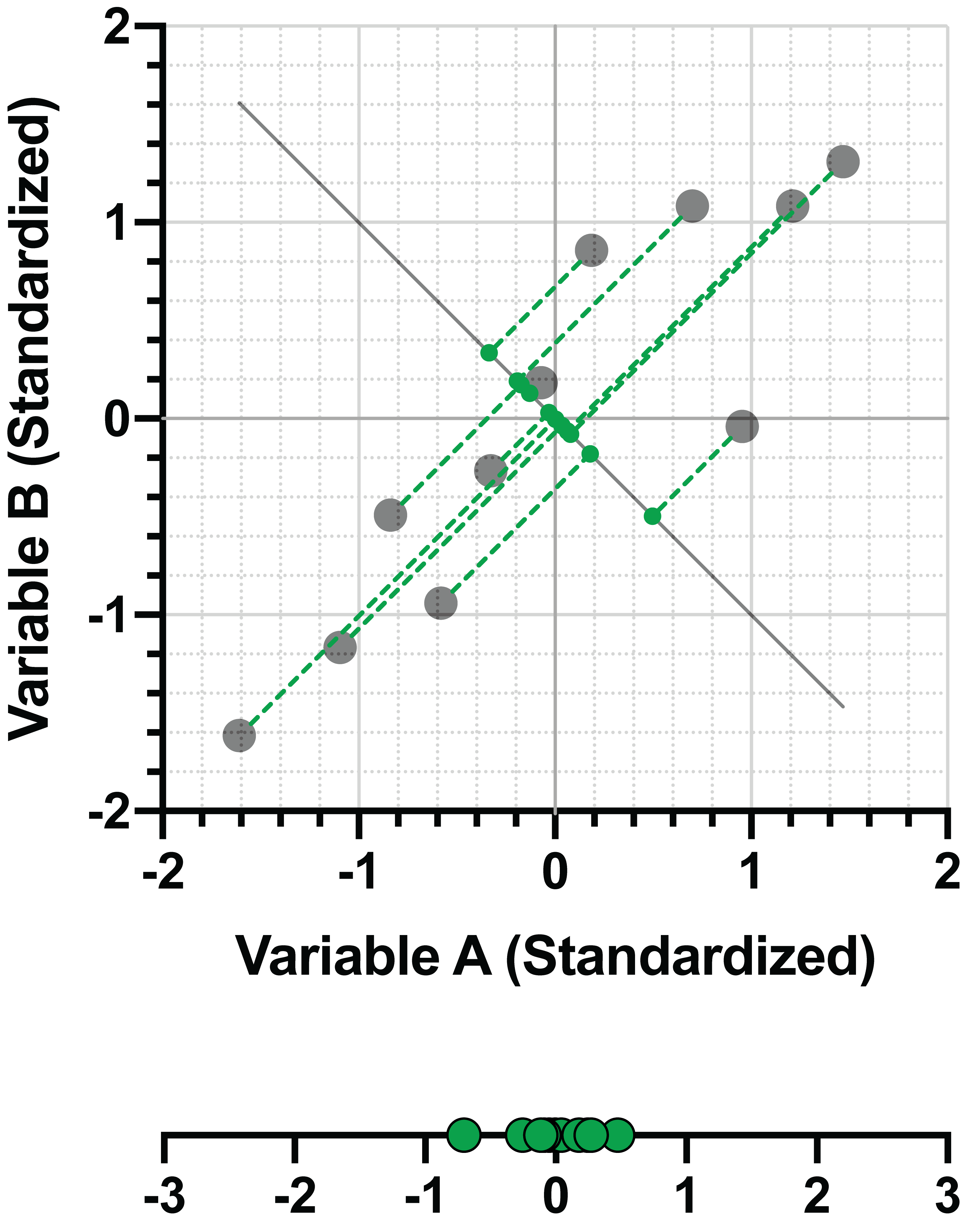
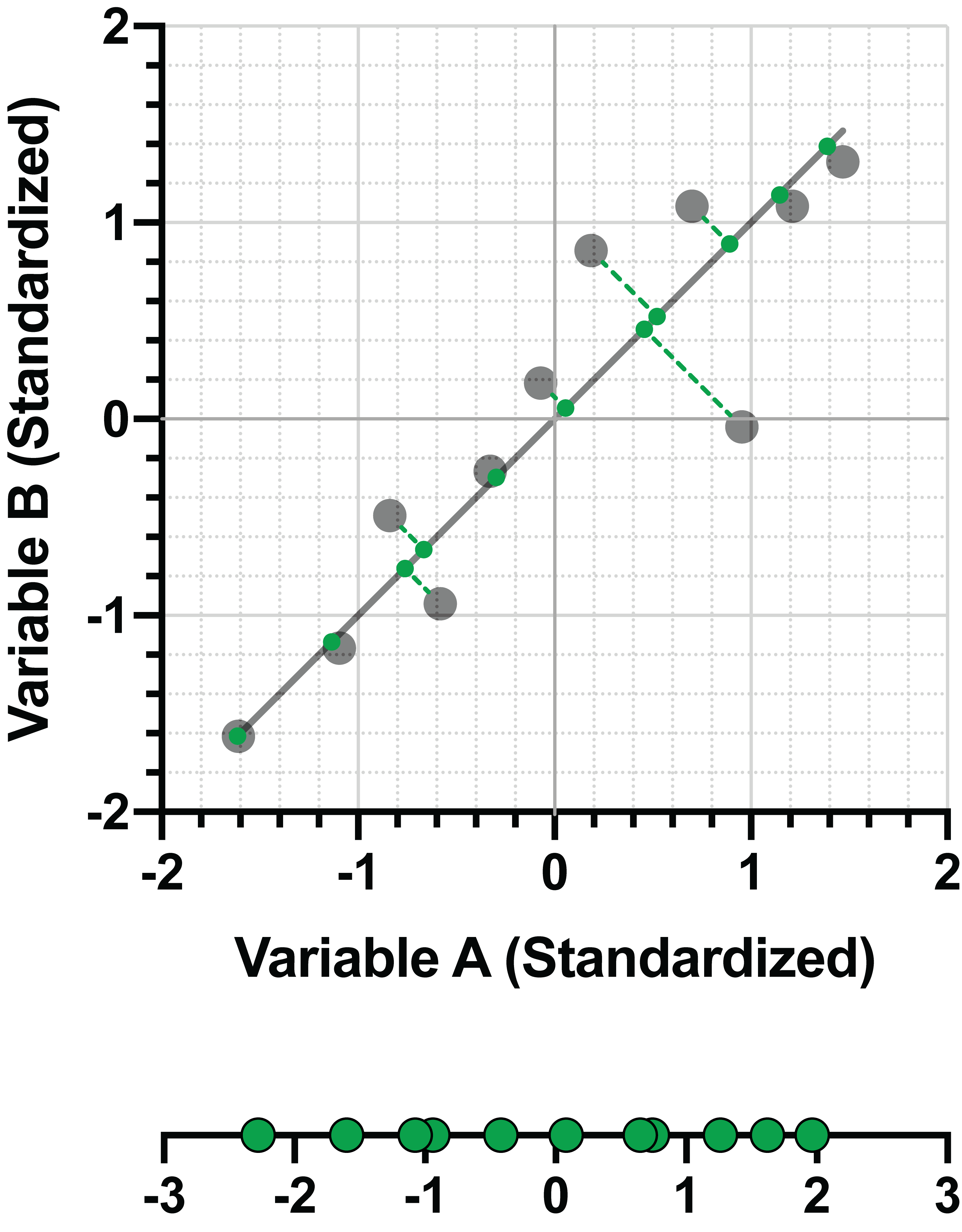
In the right panel of the example above, the line (let’s call it PC1 for the “first principal component) can be represented as a linear combination of the two (standardized) variables. For this example:
PC1 = 0.707*(Variable A) + 0.707*(Variable B)
Advanced note: the coefficients of this linear combination can be presented in a matrix, and are called “Eigenvectors” in this form. This matrix is often presented as part of the results of PCA
With this formula, we now have a way to approximate (“reconstruct”) the original data using a smaller number of variables (in this case, reducing only from two variables down to one). The following table shows the resulting values when plugging in the values of Variable A and B into this equation:
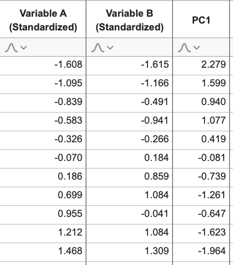
These values for PC1 are called the “Scores” of PC1, and represent the location of the projected data onto this PC (see the number line in the graph on the right above and compare it to the values in this third column).
The example above uses a simple dataset with only two variables. Because the goal of PCA is dimensionality reduction, we only looked for the first principal component. However, in the next section, we’ll discuss how additional PCs are defined.
One last thing. We now know that PCs are defined by maximizing the variance of data in the projection. To illustrate this a bit more, take a look at the following image:

This is another 2D projection of the same 3D object presented earlier, and it should be pretty clear what we’re looking at now. If we think about the length of the body of the shark being the X axis, the height as the Y axis, and the width as the Z axis, then this image shows a projection of the shark onto the XY plane. The earlier (less informative) projection was the same shark projected onto the YZ plane. The reason this second projection is more “informative” is because most of the variance of the data lies in the X direction! We are able to get more information from this “side view” because it retains more of the variance of the original data, in the same way that PCs are defined.
However, while the “head on” view may be less informative when it comes to projection of the data, this view is far more informative of how fast you should be swimming...