
Prism 3 -- Analyzing Dose-Response Data
Step-by-Step Examples:
Analyzing Dose-Response Data with Prism 3
A dose-response curve is a plot of response to drug treatment vs. drug concentration. Sensitivity to a drug acting at a specific, saturable receptor typically spans a large concentration range, so dose-response curves are usually semi-logarithmic, i.e., the amount of drug is plotted as the log of drug concentration. This example will show you (1) how to use Prism to fit a sigmoidal (also known as “logistic”) curve to your dose-response data and (2) one way to compare two dose-response curves statistically.
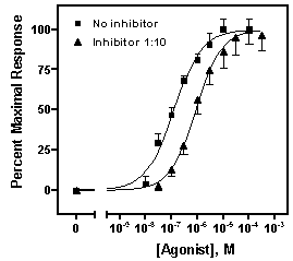
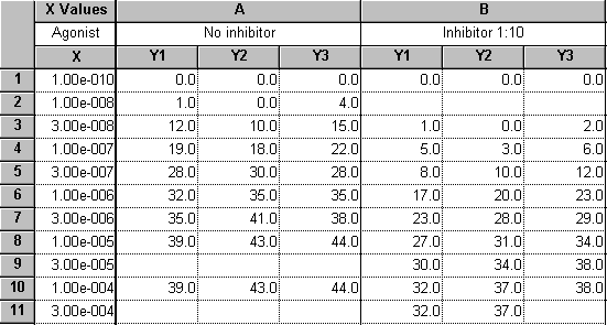
Suppose we want to plot two dose-response curves, showing the average in vitro response to an agonist, in the presence and in the absence of an antagonist, measured in triplicate. Further, we wish to include on the graph a zero-concentration control value.
Enter the Data
In the Welcome to Prism dialog box, select Create a new project and Work independently. Under the X Column category, select Numbers, and under the Y Columns category, choose 3 replicates to calculate error bars.
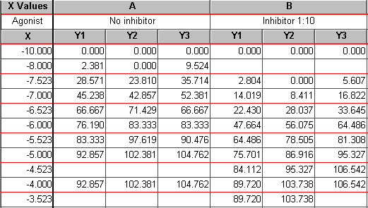
Enter the data as shown below. The X values (agonist dose) are given as molar concentration, expressed in exponential notation. The Y values (response, in arbitrary units) go in subcolumns Y1 to Y3
Several points about this data are worth noting:
The dosage increment (10 nM, 30 nM, 100 nM, etc) shown in the X column is typical. These values will be log-transformed, giving roughly equal horizontal spacing of data points on the dose-response curve.
These data are a good illustration of Prism’s use of only one X column. Although the X values for data sets A and B are not the same, we can combine all the X values into a single column and leave Y-value cells empty where appropriate.
The values in row 1 represent the zero-concentration (no agonist) data. Since our X coordinates will be plotted as logarithms, and since the log of 0 is undefined, we approximate this point with an X coordinate of 1.0e-010, about 2 log units below the lowest “real” X value. Later on, we’ll show how to place a zero on the X axis for this data point.
For this example, we’re assuming that the Y values do not require correction by subtraction of a baseline—the minimum Y values are already zeroes. If you wish to subtract a baseline value from each Y value in a data set, read about automatic baseline corrections using Prism in the GraphPad Quick Answers Database. Later in this example, we’ll demonstrate normalization of the Y values, which can also serve as a means of “baseline correction”.
You can enter the Y values in any convenient units, then transform to other units if you wish. We’ll use Prism to normalize (i.e., transform to percent of maximal response) our Y values later.
Particularly when dosing with an impure preparation, you may wish to enter X values in terms of “dilution factor” or in mass/volume (e.g., mg/mL) units. The Quick Answers Database has more information about working with dilution factors. Using mass/volume units is not a problem, although it may cause Prism to display an “error” message, which we’ll discuss later.
Log-transform the X values
| Note: The relationship between dose and response in a system following mass-action kinetics is hyperbolic, not sigmoidal. The dose-response curve becomes sigmoidal only when response is plotted against the logarithm of dose, and Prism's built-in sigmoidal dose-response curve-fit models presuppose that your X values are in that form. Users occasionally find that their dose-response relationships are sigmoidal before log transformation — in that case, we recommend this user defined model. |
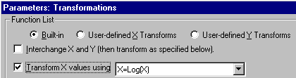
To convert the values in the X column to their respective logarithms, click Analyze. Choose Built-in analysis. From the Data manipulations category, select Transforms.
In the Parameters: Transformations dialog, choose to Transform X values using X=Log(X).
| Note: At the bottom of this dialog, there is an option to Create a new graph of the results. But we're not ready to do that; we have one more manipulation, namely normalization, to do before making the final graph. |
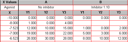
Prism displays a new Results sheet (partly illustrated below) with the log-transformed X values.
Normalize the Y Values
In this section, we’ll convert the Y values in data sets A and B to a common scale. This is useful when you want to compare the shape or position (EC50) of two or more curves and don’t want to be distracted by different maximum and minimum values.
With the log-transformed Results sheet in view, click Analyze.
In the New Analysis dialog, choose Analyze the results table you are looking at.
In the Analyze Data dialog, select the Data manipulations category, then choose Normalize.
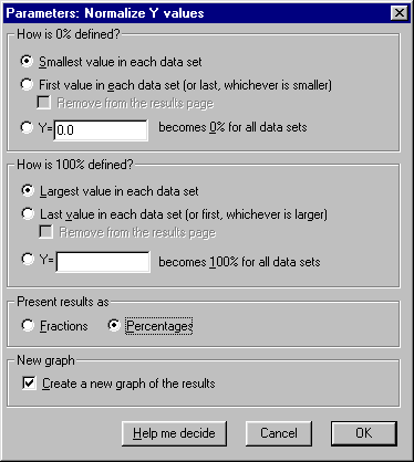
In the Parameters: Normalize Y values dialog, specify how Prism will normalize the Y values. For this exercise, we’ll accept the default settings, which will define 0% and 100% as the smallest and the highest values, respectively, for each of the data sets.
| Normalizing the data in this way converts it to "Percent of maximum response". Note two points: (a) Normalization will cause the dose-response curve to extend vertically from 0 to 100 by definition, and we'll constrain the curve fit later to ensure this. Therefore, you should be fairly confident of the accuracy of your minimum and maximum values. (b) In this example, the minimum Y values were already zeroes, so no alteration of the minimum values will be made. Note, however, that had these values been greater than 0, the normalization would effectively have produced a "baseline correction". |
Choose to Present results as Percentages. And since the results of this “analysis” are the values that we will finally graph, check the box to Create a new graph of the results. Overlooking this checkbox is a very common mistake. The settings are shown here:
The Results sheet (below) is displayed. Because we have replicate Y values, 0% and 100% are defined by the mean of the replicates. It is neither possible nor desirable to normalize each subcolumn separately. This is why none of the upper Y values in the table is exactly 100.
Now click the yellow Graphs tab on the toolbar…
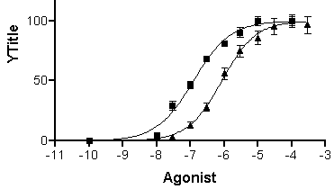
…to switch to the graph of the log-transformed and normalized data:
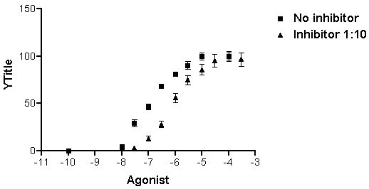
Note that, unless you specify otherwise, Prism plots the averages of replicate data and adds error bars automatically.
Fit the Curve
With the graph displayed, click on the Analyze button. From the Curves & Regression category, select Nonlinear regression (curve fit).
In the Parameters: Nonlinear regression dialog box, choose Classic equations. Select Sigmoidal dose-response (variable slope).
| Which sigmoidal dose-response curve-fit model should you use? When you choose Sigmoidal dose-response, Prism assumes that the curve has "standard" steepness (a Hill slope of +/- 1) and fits only the Top, Bottom, and log EC50. Other programs may refer to this model as "three-parameter logistic". If you suspect that your curve has more or less than normal steepness, choose Sigmoidal dose-response (variable slope), and Prism will also fit the Hill slope. Other programs refer to the variable-slope model as "four-parameter logistic". |
This is normally all you need do to prepare Prism to fit the curves, and if you were to click OK at this point, Prism would perform a four-parameter (bottom, top, log EC50, and Hill slope) sigmoidal curve fit and add the curves to the graph. But let’s instead choose two options:
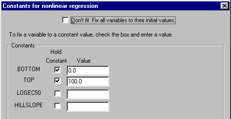
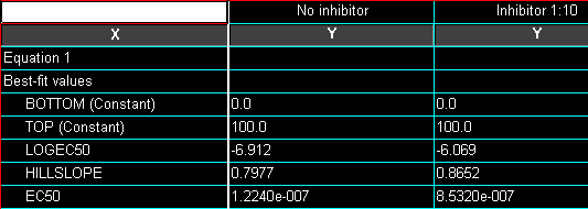
(1) Since we normalized the original data such that the vertical range extends by definition from 0 to 100, it doesn’t make sense to fit the “bottom” and the “top” of the curves. We will therefore constrain those parameters, leaving only the midpoint (log EC50) and slope (Hill slope) of each curve to be fitted by Prism. Click Constants…. In the Constants for nonlinear regression dialog box, check the Hold Constant boxes for BOTTOM and then enter the value “0”. Repeat for TOP, setting that value to “100”. The settings are shown below. Click OK to return to the Parameters: Nonlinear regression dialog box.
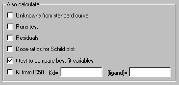
(2) Instruct Prism to compare the two curves statistically—that is, compare the fitted values log EC50 and Hill slope—using a t test. In the Parameters: Nonlinear regression dialog box, check the box to calculate t test to compare best fit variables.
Information about comparing three or more curves statistically is available from the GraphPad Quick Answers Database.
As mentioned earlier, if the units for your original X values are such that their logs are greater than zero (e.g., units of ?g/mL), Prism may produce an “error” message at this point. Read the explanation here.
When you click OK to exit the Parameters: Nonlinear regression dialog, Prism fits the curves and places them on the graph.
Click the yellow Results tab to display the numerical results (reproduced partially below).
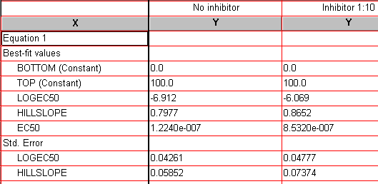
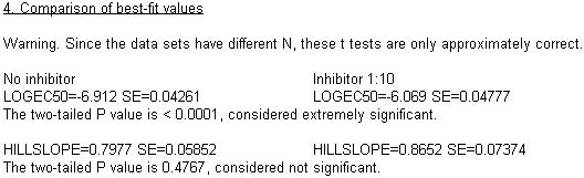
Since we fixed the values for BOTTOM and TOP, Prism reports those as “Constant”. Best-fit values for the remaining two parameters, “LOGEC50” and “HILLSLOPE” , are reported along with their standard errors. “EC50” is also reported, but it is not a fitted value; Prism simply reports the antilog of the best-fit value for EC50.
| Users frequently protest the fact the standard error for EC50 is not reported. But here, the standard error is derived from the curve fitting process, and the fitted parameter (X variable) is log EC50, not EC50. You can read a more detailed explanation here. |
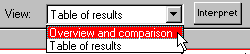
To view the results of the t test, as well as a narrative report on the curve fit, switch to the Overview and comparison view of this results sheet:
Note that additional help for understanding your results is available when you click the Interpret button.
The t test results indicate a highly significant difference between log EC50 values, but no significant difference between Hill slopes. Here is a partial reproduction of the t test results:
Format the Axes
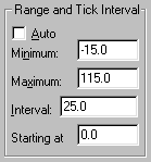
Click on the yellow Graphs tab to return to the graph. If you’d like a frame around your graph, double-click one of the axes to open the Axes dialog. Under Frame & Axes, choose Plain Frame in the drop-down box. We can also increase readability by adjusting the range and tick intervals for the Y axis: at the top of the Axes dialog box, select Y axis from the Axis drop-down box. Deselect the Auto option under Range and Tick Interval. Set the Range and Tick intervals as follows:
Now we’ll format the X axis, placing a break in the axis between our “zero” point and the rest of the curve. If necessary, double click on the X axis to reopen the Axes dialog box. In the drop-down Axis box at the top, choose X Axis. From the Gaps and Direction drop-down list, choose Two segments. From the Segment drop-down, choose Left. Deselect the Auto limits & interval checkbox and then enter the values shown below.
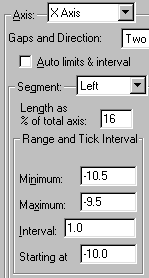
Now reset the Segment to Right and enter, or verify, the following settings:
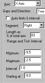
This produces a break in the axis approximately 1/6 of the way across, between X = -10 and X = -9.
| For the settings above, you may have to resort to some trial and error to get the look you want. One hint: Try selecting, then "dragging", the ends of the X axis segments directly on the graph, which will adjust the value for Length as % of total axis automatically. |
Now we’ll substitute the value “0” for “-10” on the left axis segment. In the Axes dialog box, make sure that the Left segment of the X axis is selected, then click Custom ticks.... In the Define Custom Axis Ticks dialog, choose to show Both custom and regular tick labels or Custom ticks only.
|
A common problem with setting up custom tick labels is making the wrong choice about which labels to show. In this example, either Custom ticks only or Both work because the left axis segment Range and Tick Interval settings were chosen so that that segment would contain only a custom label. But it's usually not that simple, so make this choice carefully.
Although the "Custom Ticks" feature is quite versatile, it can be confusing to the new user. For more information, read the section on Custom Ticks in the Prism 3 manual. |
Enter the definition for a custom tick at the position of X = -10, labeled “0”, with a tick mark. Here are the settings:
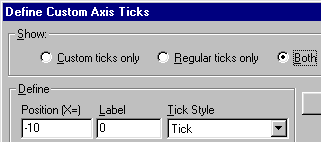
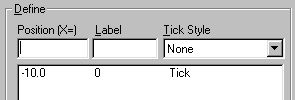
Click Add. Prism begins a list of custom ticks:
When you click OK from the Custom Ticks dialog, you will be returned to the Axes dialog. If desired, change how Prism expresses the values on the right-hand segment of the X axis as follows: Change the axis Segment to Right. Now change the setting in the Format drop-down list under Numbering/Labeling. Only two of the four choices produce usable results in this example,
Decimal:
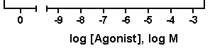
or Power of 10:
If you choose the “Power of 10” tick labeling option, you may also wish to add logarithmic minor ticks. In the axes dialog, choose Log in the Tick Options.. Minor Intervals drop-down list.
| Prism doesn't alter the axis titles to reflect the tick labeling format — we did that manually for this illustration. |
When you want to use one of the other (longer) formats, Scientific or Antilog, you may need to create room for the labels; try dragging the axis to make it longer, or modify the tick interval settings (Axes…Range and Tick Interval).
Complete the Graph
If you’d like to prevent overlapping of closely spaced error bars, double-click on one of the symbols for the “No inhibitor” data to open the Format Symbols and Lines dialog. Adjust the error bar direction (Dir.) to show only the top half (Above) of the bar. And for this example, let’s switch to standard deviation (SD) error bars. Here are the error bar settings:
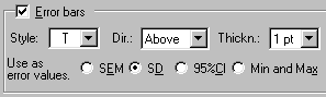
Repeat for the “Inhibitor 1:10” data, choosing this time the lower half of the bar. Your graph should now look something like this (we edited the axis titles and relocated the legends):
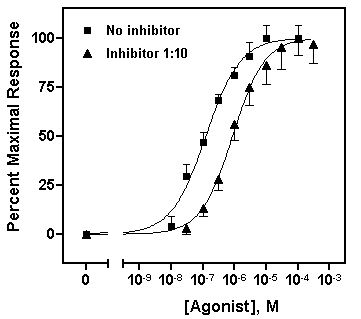
We’ll now transfer some information about the best-fit parameters from the Results page directly to the graph. The simplest technique is to return to the nonlinear regression results sheet—remember to switch the View back to Table of results — and drag your cursor to select the results of interest:
Choose Edit...Copy, switch to the graph, and choose Edit...Paste Table. You can now select the embedded table and drag it to a convenient open spot (in the illustration below, we removed the frame around the plot area).
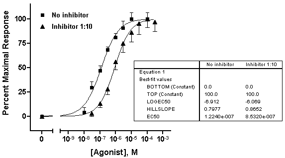
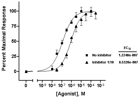
With some ingenuity, you can improve the cosmetics and narrow the information down to what’s important. In the illustration below, the EC50 values were pasted individually and situated next to the legend elements. The heading “EC50” was generated using the text tool (“A” button on the toolbar), and the line below “EC50” was made with the line-drawing tool.
The beauty of pasting results from the Results sheet to your graph is that, since all related steps in your project are linked, changing your data will result in all corrections being made on the graph automatically — including the pasted values for EC50.Try it! This saves effort not only when you need to correct data errors, but every time you need to construct a new dose-response curve. In face, once you’ve settled on the design of your dose-response curve, consider saving your entire project, for use with new data, as a template.