




Analyzing RIA and ELISA Data
Analyzing radioimmunoassay (RIA) or an enzyme-linked immunosorbent assay (ELISA) data is a two-step process:
- Prepare and assay a set of "known" samples, i.e., samples that contain the substance of interest in amounts that you choose and which span the range of concentrations that you expect to be present in your "unknown" samples. The quantity that you measure (radioactivity, optical density, or luminescence, for example) is related graphically to sample concentration to produce a standard curve.
- Assay the "unknown" samples. Then, for each measurement obtained, use the standard curve to find the corresponding substance concentration. Graphically, this amounts to finding the X-axis value (concentration) for a given Y-axis value (measured quantity).
Prism automates the process of producing a standard curve and interpolating unknown concentrations from it. Follow these steps:
Enter the Data
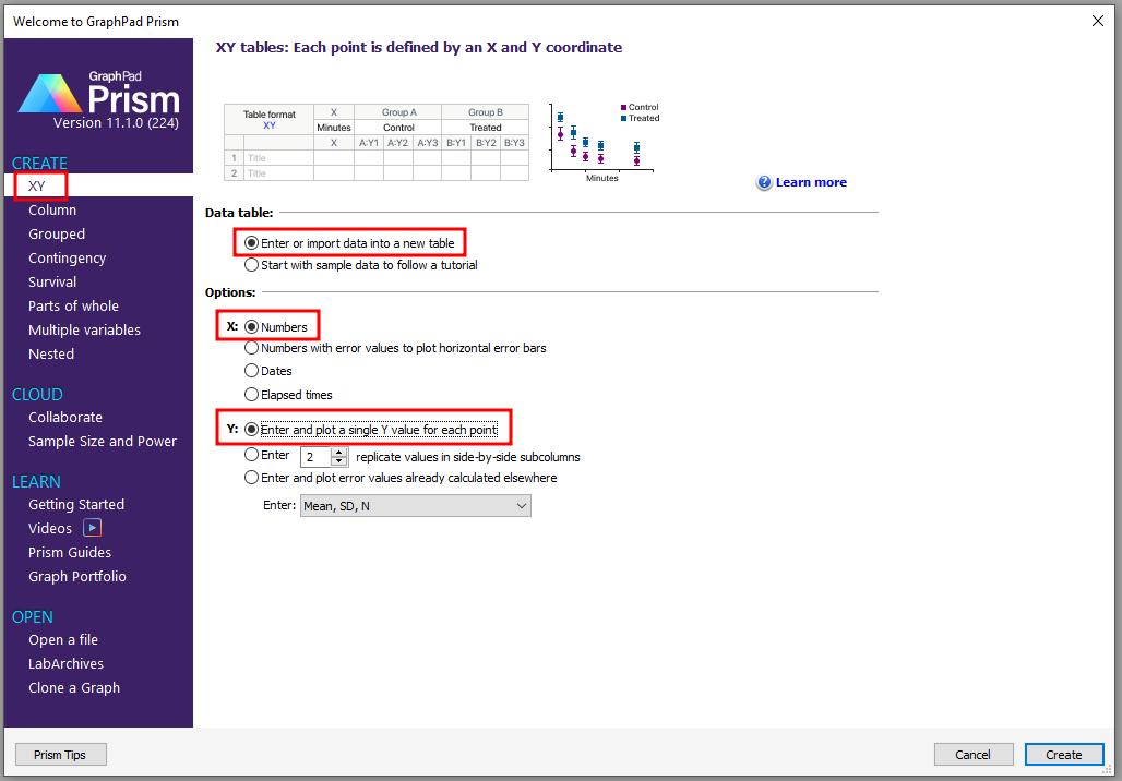
In the Welcome to GraphPad Prism dialog box, select Create an XY data table. Choose to format the X values as Numbers and to format the Y values for the number of replicates in your data. For this example, we choose Enter and plot a single Y value for each point.
RIA/ELISA data often span such large concentration ranges that concentrations are plotted as their logarithms. We'll follow that convention here and let Prism compute the logarithms for us.
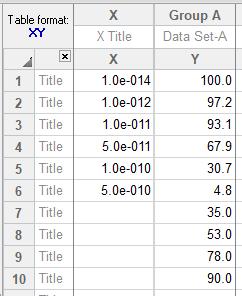
Enter data for the standard curve. For our example, enter "known" sample concentrations into the X column, rows 1-6, and the corresponding assay results into the Y column. Sometimes you'll want to include data from a zero-concentration sample. Since our data will be graphed on a semi-log plot and it's impossible to plot the log of 0, we approximate the zero-concentration point in row 1 with an X coordinate of 1.0e-014, two log units below the lowest non-zero X value. Including this data point will help to define the top of the fitted curve more accurately.
Just below the standard curve values, enter the assay results (Y values, rows 7-10) for the "unknown" samples, leaving the corresponding X cells blank. Later, Prism will fit the standard curve and then report the unknown concentrations using that curve.
Transform the Data
To convert the values in the X column to their logarithms, click Analyze. From the Transform, Normalize... category, select Transforms and click OK.

In the Parameters: Transform dialog, choose to Transform X values using X=log(X). The selections are shown below.
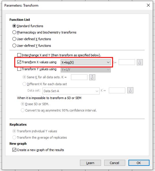
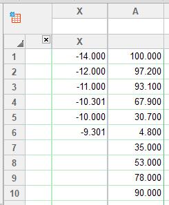
At the bottom of this same dialog box, Create a new graph of the results is chosen by default. Click OK. Prism displays a new Results sheet with the log-transformed X values.
Fit the Curve
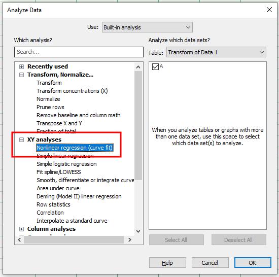
Click on the Analyze button. From the XY analyses category, select Nonlinear regression (curve fit).
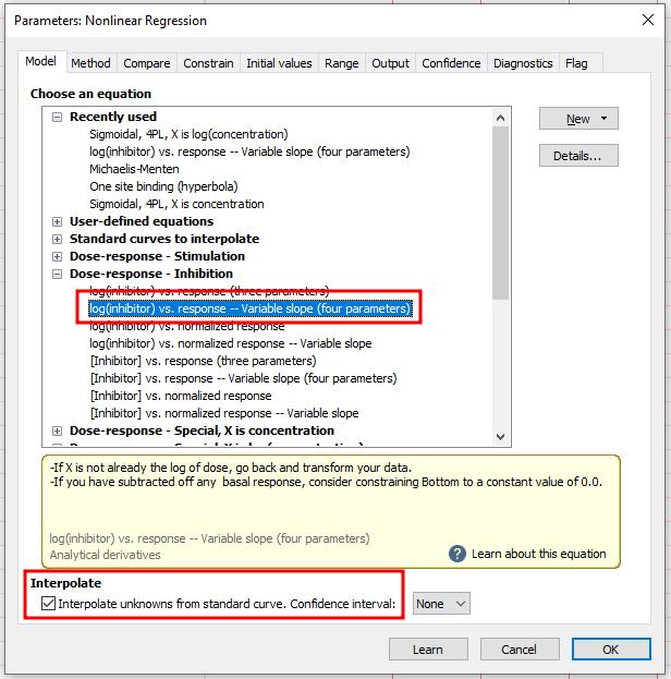
In the Parameters: Nonlinear regression dialog box, choose Dose-response - Inhibition. Select log(inhibitor) vs. response -- Variable slope (four parameters) for our example, although you may wish to experiment with other equations. Since we want our unknown concentrations to be provided, check the box labeled Interpolate unknowns from the standard curve.
View the Results
Prism displays the results of nonlinear regression on tabs. The default tab (called Table of results) shows the defining parameters for the curve of best fit. For a routine RIA, you may not care too much about the information contained in this page.
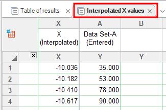
Switch from the default tab to Interpolated X values (in early Prism releases, this was "Standard curve X from Y"). Prism reports the corresponding X value for each unpaired Y value on your data sheet. These values are expressed as logarithms of concentration.
Change from Log of Concentration to Concentration
Although it's generally easiest to plot and analyze semi-logarithmic RIA/ELISA data, perhaps we'd like to read our unknown concentrations directly, not as logarithms.
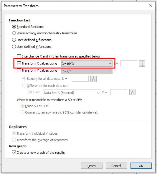
Click on the Analyze button and select Transforms. In the Parameters: Transform dialog, check the box for Transform X values using... Select the equation X=10^X from the drop-down list. This is the inverse of log base 10, a process known as exponentiation.
Click on OK. Prism creates another results sheet, on which the X values are now expressed as concentration.
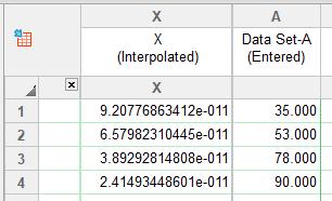
Add Unknowns to your Graph
Prism's automatic graph includes the data from the data sheet and the curve. To add the "unknowns" to the graph:
Switch to the Graphs section of your project.
Click on the Change button and then select Data Sets on Graph.
The dialog box shows all data and results tables that are represented on the graph. Click on the Add button. From the drop-down list at the top of the Add Data Sets to Graph dialog box, select Nonlin fit of Transform of..., as seen below.
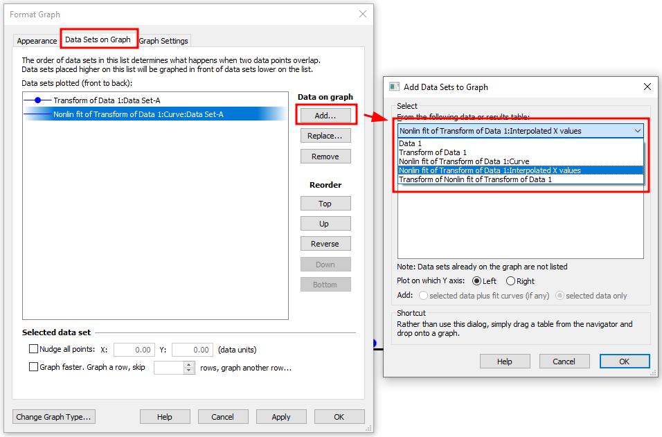
Press OK to return to the graph.
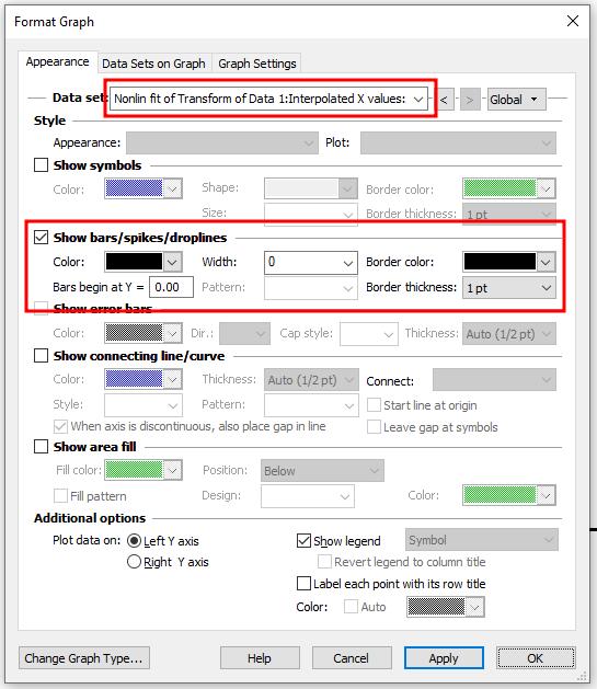
If you want the "unknowns" represented as spikes projected to the X axis (rather than data points), double-click on the graph to bring up the Format Graph dialog. From the "Data set" drop-down list, select Nonlin fit of Transform of.... Adjust the options as seen below (show bars/spikes/droplines).
Here are the standard curve results -- The illustration includes some formatting changes not discussed here. Numerical results are added as an embedded table.

Keywords: RIA ELISA