
Graph tip - Don't use a log scale on a bar graph!
Using a logarithmic axis on a bar graph rarely makes sense.
Prism can make bar graphs with a logarithmic Y axis, but think twice before deciding to make this kind of graph. The point of a bar graph is to let people compare heights or areas of the bars. In most cases, you should try to avoid using a log axis when creating a bar graph.
Examples:
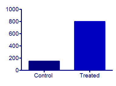
The treated bar in the graph below is four times as tall (and has four times the area) as the control bar. This tells you that the treatment increased the response fourfold. This is very straightforward since the Y axis is linear.
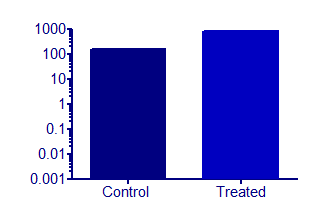
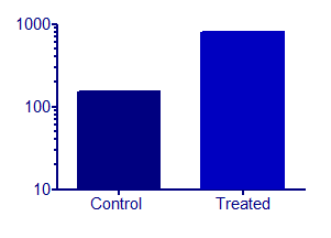
But beware of bar graphs with a logarithmic axis. Since zero can’t be shown on a log axis, you need to decide where to begin the axis. A log scale has no logical starting place, so the choice is arbitrary. The graphs below show the same data as the graph above, but with the Y axis beginning at 0.001, 10 or 100.
 |
 |
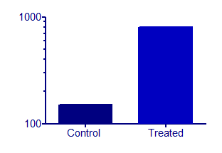 |
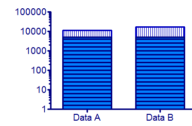
The relative height of the bars appears to be almost the same in the graph on the left and very different on the graph on the right. The relative heights (or areas) of the bars on a log scale is not informative. Bar graphs with a logarithmic axis can be misleading.
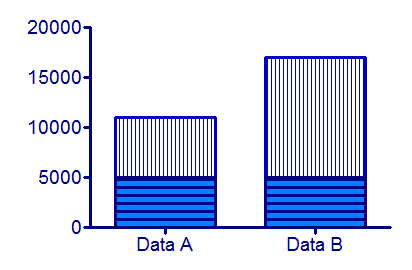
This can be especially misleading when you use a log axis on a stacked bar chart. In the graph below, it is clear that the two stacked bars of data set A are equal in value, and that the top bar of data set B is twice as large as the bottom bar.
A graph of the same data on a log axis looks quite different, and is misleading.
Download this file if you would like to see how these graphs were made.