
KNOWLEDGEBASE - ARTICLE #1944
How to create a 100% stacked column graph
Excel uses the term "100% stacked column" graph to refer to a stacked bar graph, where the sum of all the slices is 100.
Prism 6 lets you make that graph in two ways.
- As a parts of whole graph. Parts of whole data are often plotted as pie charts, but Prism lets you show it as a stack if you want (horizontal or vertical). When plotted this way, Prism doesn't show any axis, so you get a visual sense of the division with no numbers (unless you ask Prism to superimpose each percentage value on each slice). A parts of whole graph plots data you entered into one column (without any subcolumns). If you want your graph to have several stacks, you'll need to make them individually, and then combine them on a layout.
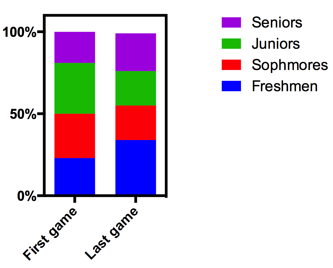
- As a stacked bar graph. This is generally a better approach, as it lets you create several stacks in one graph. Enter data onto a Grouped table. Each row in the table becomes one stack in the graph. If you enter the data so the values sum to 100, you can plot these directly. If your values don't sum to 100, Prism can normalize them so they do. Don't use the Normalize analysis. Instead use the "Fraction of total" analysis (new to Prism 6) and choose to divide each value by its row total and report the results as percentages. Then plot the results.
The attached Prism file shows several examples.
If you use Prism 5, you'll need to use the second approach above. There is no Fraction of Total analysis, so you'll need to figure out how to do the math using Normalize, Transform, Row means, or Remove baseline analyses.