




Kaplan Meier Survival Analysis
With some experiments, the outcome is a survival time, and you want to compare the survival of two or more groups. Survival curves show, for each plotted time on the X axis, the portion of all individuals surviving as of that time. The term "survival" is a bit misleading; you can use survival curves to study times required to reach any well-defined end point (e.g., re-occlusion of a grafted blood vessel, first metastasis, discharge from the hospital).
Prism creates survival curves using the method of Kaplan and Meier and calculates the 95% confidence interval for fractional survival at any particular time. Prism can also compare two or more survival curves using the log-rank test or the Gehan-Breslow-Wilcoxon test.
To create a survival curve using Prism, follow these steps:
Enter the Data
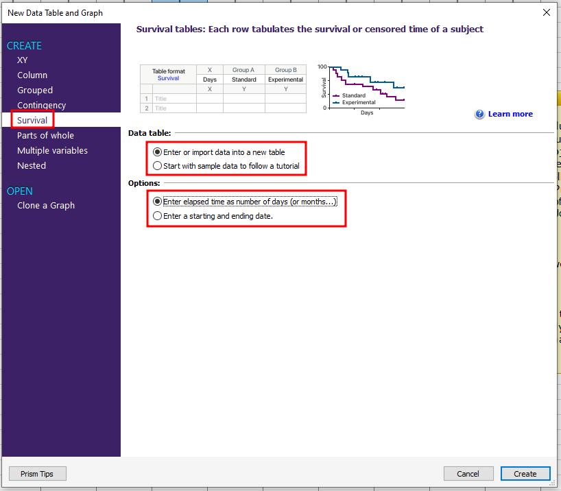
In the Welcome dialog box, select Create a Survival data table. There are options available to enter an elapsed time as number of days (or months, etc.) or to enter a starting and ending date. For this example, we will enter the elapsed time.
For each subject in the study, enter into the X column the time elapsed (e.g., days, months) between entry of the subject into the study and the time of the "outcome" event for that subject. This is the survival time for that subject. In the Y column, enter the code "1" to denote occurrence of your designated experimental outcome, or the code "0" to denote that the subject was censored, opposite the corresponding elapsed time (X-column entry).
A subject is censored when you have no useful information about what happened to the subject after that time. Subjects alive at the end of the study are censored, because you do not know about their later survival. Subjects who leave the study are also censored - either because you do not know whether or not they survived, or because you can't use that information because they were no longer following the study protocol.
If you have more than one event for a particular time, simply enter multiple rows with the same X value.
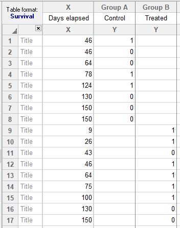
For this example transplant study, we'll describe just the Control data in column A. Subjects in the Control group died (code = 1) at 46, 78, and 124 days after transplant. One subject in the Control group was lost to follow-up (code = 0) 46 days after treatment, and another was dropped for noncompliance (code = 0) 64 days after treatment. At the end of the study, three subjects were still alive and enrolled in the study; one had survived for 130 days, and the other for 150 days, after treatment.
You don't have to enter X values in order of occurrence. In fact, if it is more convenient, you can enter all of your data for a particular treatment group together, as shown above. Just be sure to match each event code (Y-column entry) to its proper time (X-column entry).
Before proceeding, make sure that each subject in your study is represented exactly once (by either 1 or 0) in the Y data column. In other words, the total number of 1's and 0's entered in each column should equal the number of subjects in that group.
For more information about entering survival data, consult this knowledgebase article: How survival analyses work.
Analyze the Data
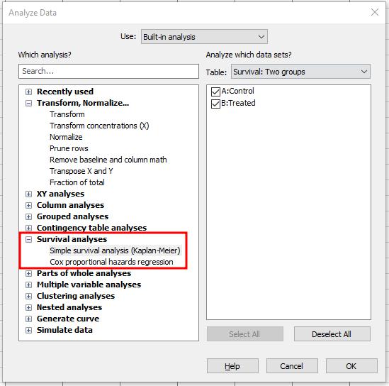
Click the Analyze button. Choose Survival analyses. From the Survival analyses category, select Simple survival analysis (Kaplan-Meier).
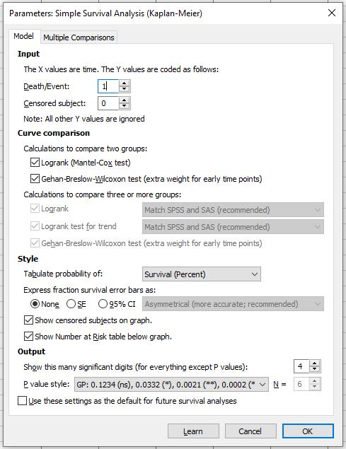
In the Parameters dialog box, accept the default coding. Although you can redefine the codes (use digits, not letters), 1 is ordinarily the code for death (or similar endpoint, while 0 indicates a censored subject). In the Style portion of the box, select Survival (Percent), so that Prism will express your data as the percentage, rather than a fraction, of all individuals, and it will display the decreasing survival as a downward-sloping curve. Choose Show censored subjects on graph, so that each censored subject will appear as a data point on a flat part of the curve.
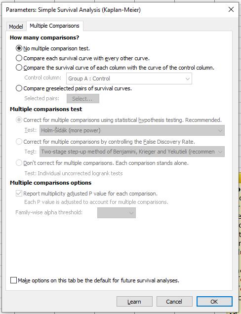
If you have more than two groups, the Multiple Comparisons tab will become available. On this tab you can compare each curve with every other, compare each to a control, or compare preselected curves. Corrections for multiple comparison testing through Holm-Sidak, Bonferroni, and Sidak are available.
View the Results
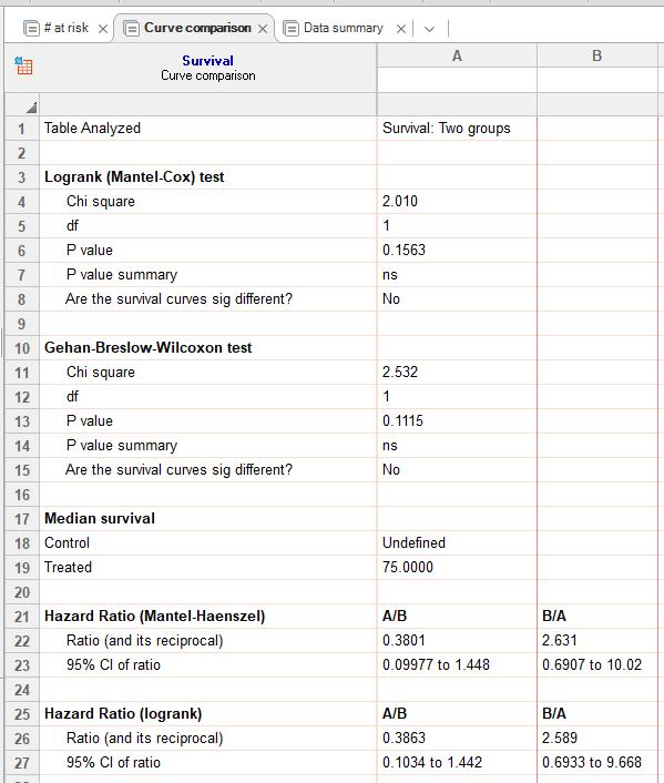
You can see the results on three tabs: # at risk, curve comparison, and data summary.
Complete the Graph
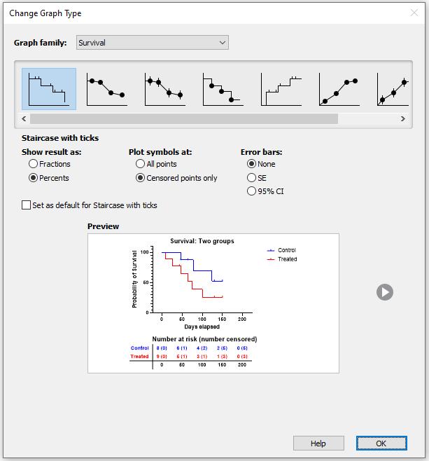
Click on the Graphs section to view the graph automatically created by Prism (a staircase with ticks). There are options to show results as fractions or percents, to plot all symbols or censored points only, and to plot error bars (standard error or 95% confidence intervals).
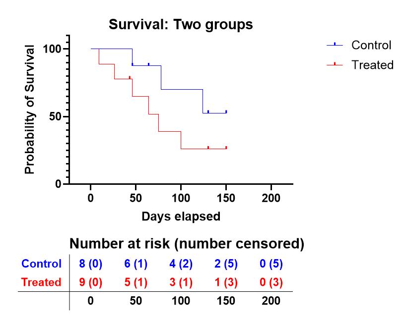
Here is the plot that is created automatically:
Keywords: kaplan meier survival analysis