
Graph tip - Changing the width and spacing of columns in Column and Grouped graphs
.png)
These examples demonstrate how to adjust the width of columns (bars, violins, box-and-whiskers, column scatter, etc.) and the spacing between columns for Column and Grouped graphs (Bonus: adding annotations to bar graphs)
General Information
Prism automatically sets the width of the bars (violins, box-and-whiskers, column scatter plots, etc.) and the spacing between these objects on Column and Grouped graphs by taking into account the overall size of the graph (the width of the axis) and the total number of objects or groups on the graph. There are a number of ways to adjust the width of the objects/groups and spacing between each object/group. Note there are separate instructions below for Column graphs and Grouped graphs.
Column graphs Grouped graphs Adding Annotations to bar graphs
Column graphs
The simplest way to change the width of any object (bar, violin, etc.) or the spacing between objects is to change the total width of the graph. If you want wider bars, simply stretch the graph axis and the width and spacing of the bars (or violins or box-and-whiskers, etc.) will change proportionally.
.png)
It's also possible to change the spacing between all of the objects without changing the overall width of the graph. First, either double click in the graphing area or click the Format Graph toolbar button in the Change section of the toolbar to open the Format Graph dialog.

Click on the "Graph Settings" tab, and find the "Dimensions" section of the dialog. There are three values that can be adjusted in this section that will modify the appearance of the graph. These are:
- Space between columns. Increasing this value will cause the gaps between objects to be wider, and subsequently the objects themselves to be narrower. A smaller value will cause the gaps to be smaller and the objects to be wider
- Before the first column. This determines how much space is left between the left side of the graph (generally the left Y axis) and the first object. If set to zero, the first bar will start exactly at the left side of the graph
- After the last column. This determines how much space is left between the last object and the right side of the graph. If set to zero, the last bar will end exactly at the right side of the graph
.png)
Compare the following two graphs. The first uses the default values of 50% for each of these "Dimension" options, while the second uses 20% for the space between columns and 10% for the space before the first and after the last column. Note that the width of the bars for each column are different for the two graphs while the width of the X axis is the same in both.
.png)
It is also possible to change the space between two specific adjacent bars individually. To do this, open the Format Graph dialog and switch to the "Data Sets on Graph" tab. Select a data set and enter (at the bottom of the dialog) the percentage of normal spacing you want between that data set and the prior one. As an example, if you enter "200", that bar will be twice as far from its left neighbor as the others. If you enter 50, it will be half as far. If you enter 0, this bar will touch the the bar immediately preceding it.
.png)
In the graph below, the spacing between the first two and the last two columns was set at 150 percent of normal. The spacing between the middle two was set at 25 percent of normal.
.png)
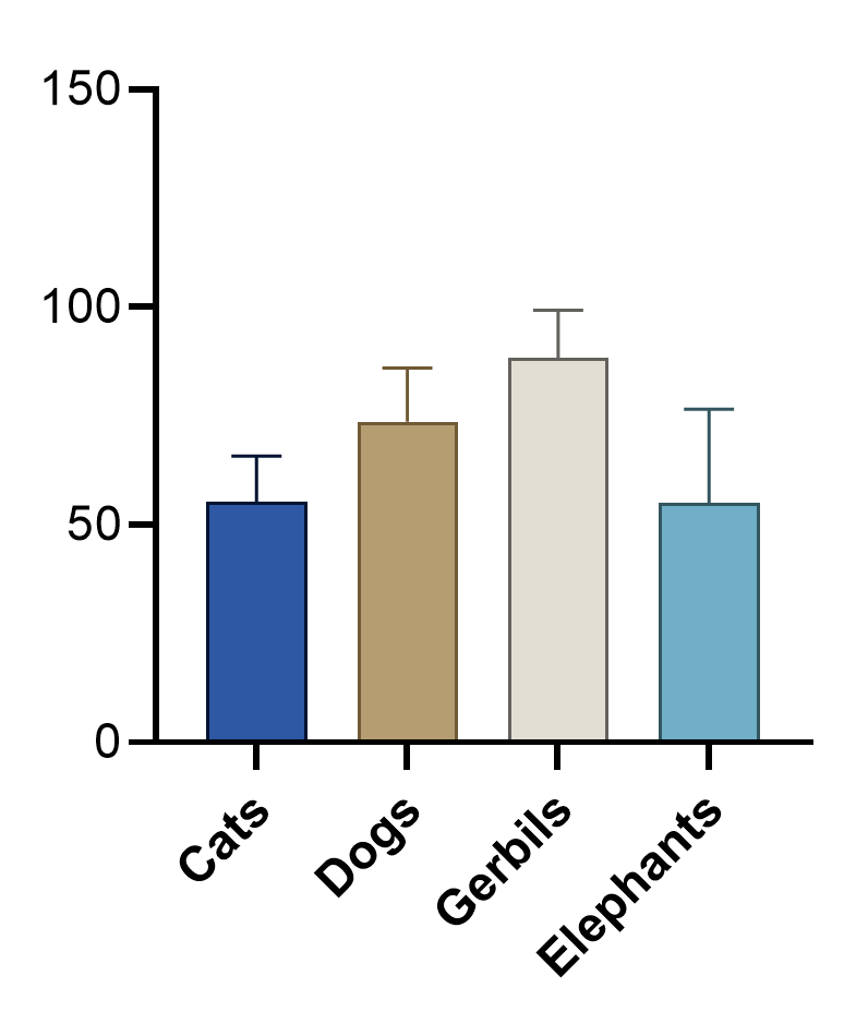
If there are no values in a data sheet column, Prism will leave a gap (a zero-height bar).
.png)
If you don't want a gap, you'll need to remove the data set from the graph. To do this, open the Format Graph dialog, switch to the "Data Sets on Graph" tab, select the data set you want to be removed, and click the "Remove" button.
.png)
Here's the same graph as above with the "Gerbils" data set removed.
.png)
Grouped graphs
Before diving into how widths and spacing of Grouped graphs can be customized, it's important to understand a bit of the structure of Grouped graphs. These graphs get their name because of the way the graphical objects are displayed. Because the data used to generate these graphs contain two grouping variables (one grouping variable defining Column titles and the other defining Row titles), the graphs are organized using a primary and secondary grouping variable. This results in multiple "groups" of objects (bars, violins, box-and-whiskers, etc.) that can be divided by column titles and then subdivided by row titles (called a "separated graph"), or divided by row titles and subdivided by column titles (called an "interleaved graph"). Check out the example graphs below showing an interleaved and separated graph for the same data:
An interleaved graph (first grouped by Color and then groups subdivided by Animal)
.png)
A separated graph (first grouped by Animal and then groups subdivided by Color)
.png)
Both of these graphs both show the same data, just organized differently! The important thing to keep in mind for adjusting widths and spacing on these graphs is that they have "groups" of objects (bars, violins, etc.), and so there is spacing between groups, and spacing between objects within groups!
Just as with Column graphs, the easiest way to change the width of groups or spacing between groups is to stretch the graph axis to make the entire graph wider or narrower. Doing this will cause the width and spacing of the groups on the graph to change proportionally.
.png)
It's also possible to change the spacing between all of the groups without changing the overall width of the graph. First, we'll open the Format Graph dialog by either double clicking in the graphing area or clicking the Format Graph toolbar button in the Change section of the toolbar.
Click on the "Graph Settings" tab, and find the section of the dialog titled "Spacing (as a percent of space used for data)". For Grouped graphs, there are five values that can be adjusted in this section that will modify the appearance of the graph. These are:
- Blank/missing cells. This value indicates how much "empty" space should be left when an object has no values to be plotted. A value of "0" indicates that no gap should be left at all. A value of "100" indicates that there should be no change to the amount of space provided for this group.
- Between adjacent data. This controls the spacing between objects within groups. Increasing this value will cause the gaps between objects within a group to be wider, and subsequently the objects themselves to be narrower. A smaller value will cause the gaps to be smaller and the objects to be wider.
- Additional gap between groups. As the name implies, this value controls the spacing between groups. As always, a larger value will cause the gaps to be larger and the amount of space dedicated to each group to be smaller (and vice-versa).
- Before the first column. This determines how much space is left between the left side of the graph (generally the left Y axis) and the first group. If set to zero, the first bar will start exactly at the left side of the graph
- After the last column. This determines how much space is left between the last group and the right side of the graph. If set to zero, the last bar will end exactly at the right side of the graph
.png)
To make these options a bit more clear, consider the following two graphs. The first uses the following default values:
- Blank/missing cells: 100%
- Between adjacent data: 50%
- Additional gap between groups: 100%
- Before the first column: 50%
- After the last column: 50%
Now compare that to a graph with these customized settings:
- Blank/missing cells: 100%
- Between adjacent data: 10%
- Additional gap between groups: 150%
- Before the first column: 25%
- After the last column: 25%
.png)
Dealing with blank or missing data on Grouped graphs is a bit different than for Column graphs. When a row/column pair in the data table has no values, the first option in the "Spacing" controls determines how to display this data. If "Blank/missing cells" is set to 100%, Prism will leave a gap where the object should have been displayed. At the other extreme, setting this value to 0% will simply omit this object from the graph and not leave any additional space. Consider the graphs below for which the data for White Gerbils has been removed from the data table.
With "Blank/missing cells" set to 100%, the graph includes a gap
.png)
Setting "Blank/missing cells" to 0% causes the resulting graph to change accordingly
.png)
Bonus: Adding annotations to bar graphs
After you've created a bar graph in Prism (both Column and Grouped graphs can be used), it is possible to add additional Annotation values to each bar on the graph. These values can be added to indicate the plotted value (the mean, median, etc.) for each bar, or can indicate the sample size (how many data points are used to calculate the height of each bar). In addition, these annotations can be added in three different locations:
- Above the bar and error bar
- Within the bar aligned at the top
- Within the bar aligned at the bottom
To add annotations to a bar graph, simply open the Format Graph dialog (by double-clicking on the graph or using the Format Graph toolbar button) and selecting the "Annotations" tab. Select the tab for the desired location (see options above), and then specify which value you would like to have shown in that position. There are additional options for formatting the value (text direction, decimal format, thousands format, color, and more).

Note that in some cases, using a single font color may not work: if you have some black bars and some white bars, neither black nor white text would be useable since some values would not show up. With the "Auto" color option selected, Prism will determine the background color that the value will be placed on, and will automatically set the font color to either black or white to ensure the greatest visibility of the label. For example, in the graph below, some annotations have white text, while others have black, making it easy to read all of the different values regardless of the bar color that they're plotted on top of.
This file contains all of the graphs used in this example so that you can explore the settings for each one.
How to compare the bar widths of two graphs
Here are two tips to measure the width of a bar, so you can check whether bars in multiple graphs are the same width.
- From the graph, drop the View menu and choose Show Rulers. Then click in the top ruler to drop a dropline. You can use that ruler to measure the width of a bar.
- Use the drawing tool to draw a horizontal line above the bar. Then click to select it and drag the ends to make its length matches the width of the bar. As you stretch the line (new in Prism 6) a tooltip will show you its length.
Keywords: columns bars width spacing gaps distances apart close