
Can Prism create horizontal error bars (showing error in the X variable)?
Prism 5 or later
Prism 5 or later allows plotting X-variable error bars. Choose to make an XY graph, and check the box to create a data table with a column for you to use for your X error values.
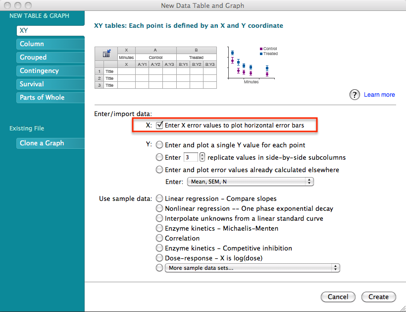
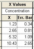
Then enter your X-Axis error values in the appropriate table. Prism won't calculate these for you. You'll have to enter SD or SEM values directly.

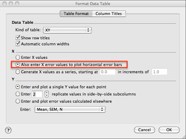
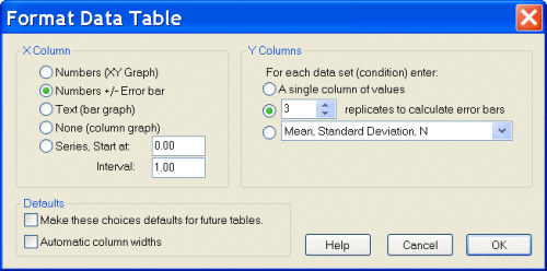
If you forgot to choose to include X error bars when you started your project, you can reformat your data table. Click theTable Format button in the upper left corner of the data table and in the Format Data Table dialog, click the box to add X-error values to the data table.

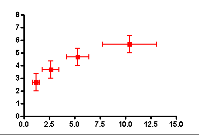
Prism automatically graphs both horizontal and vertical error bars.
-----------------------------------------------------------------------------------------------------
Prism 4
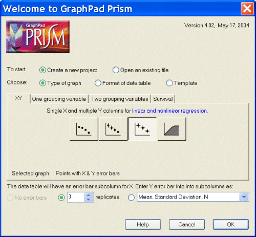
Prism 4 allows plotting X-variable error bars. Choose to make an XY graph with both vertical and horizontal error bars from the Prism Welcome screen.
Then enter your X-Axis error values in the appropriate table. Prism won't calculate these for you. You'll have to enter SD or SEM values directly.
If you forgot to choose to include X error bars when you started your project, you can reformat your data table. Click Change, and then Format Data Table.
Prism automatically graphs both horizontal and vertical error bars.
----------------------------------------------------------------------------------------
Prism 3
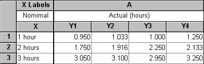
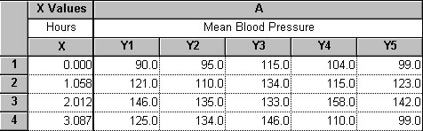
Prism 3 can only create horizontal error bars automatically for horizontal bar graphs. And even then, the bars show variation or error in the Y-column variable. There is a work-around, however. Suppose you attempt experimental measurements at predetermined times, but have difficulty meeting those times precisely. On a graph showing the time course for these measurements, you'd like to show the variability in measurement time. You could begin with a table showing actual times vs nominal times:
From this table, click "Analyze.." and choose a "Row means/totals" analysis, selecting the option to compute SEM or SD, as desired (we'll use SD here to enhance visibility of the error bars):
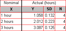
Now make a table of measured values vs actual mean measurement times (taken from the row means analysis). There is no variability at time 0 in this example; subsequent measurement times are measured relative to time 0:
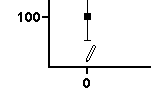
Switch to the graph produced automatically from this table. If you haven't already done so, switch on the coordinates display, which shows the exact coordinate position of your cursor whenever you place it within the plot area--choose "View... Show Coordinates". The coordinate display appears on the second row of the toolbar. Now draw the first X "error bar". Select the line drawing tool and draw a horizontal arrow with a length equal to double the standard deviation at that X value (for this example, 2 x 0.132 = 0.264). While watching the X coordinate display, start the line as near to X = 0, and end it as near to X = 0.264, as you can.


Click elsewhere to exit the line-drawing mode, then double-click on the line to open the "Format Object" dialog. Make these settings:

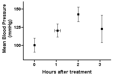
Now drag the "error bar" into position over the data point at X = 0. You can position it roughly by dragging with your cursor, then make fine adjustments using the arrow keys (with the bar selected). Here is the graph, dressed up a bit, with the first horizontal error bar in place:
Keywords: both directions X error independent