




Creating a column bar graph.
This example shows how to create and format a column bar graph, so named because each bar depicts the mean of all Y values in a column, or data set. One of three methods for graphing with bars in Prism, this approach is recommended when you have one grouping variable, because the table format is the same as that necessary to do many other analyses, such as t tests, ANOVAs, and column statistics. The primary alternative, an ordinary bar graph, is shown in Creating a bar graph.
Create the Table
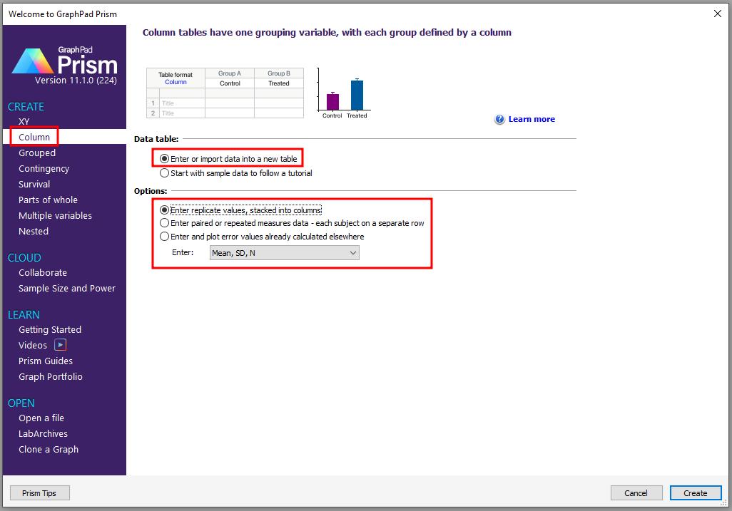
When you launch Prism, the Welcome to Prism dialog appears. It lets you create a new project (file) or open an existing one. Choose to Create a Column data table and to Enter replicate values, stacked into columns.
Enter the Data
Enter the values show below into your table. Be sure to include column headings.
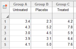
You can change the number format on a Prism table. Select all of the columns you wish to change, then click Change > Decimal Format.
View the Graph
As soon as you have entered your data, Prism creates a graph automatically. In the Explorer, click on the graph name, or click on the Graph tab.
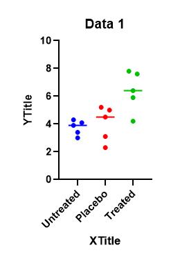
Prism automatically produces a column scatter plot, showing all data points on the table, grouped into columns according to data set. You may easily add or remove data sets from the graph (click Change > Remove/Replace Data Sets or Add Data Sets). Labels for the data sets ("Untreated", etc.) are placed beneath the appropriate "columns" on the graph.
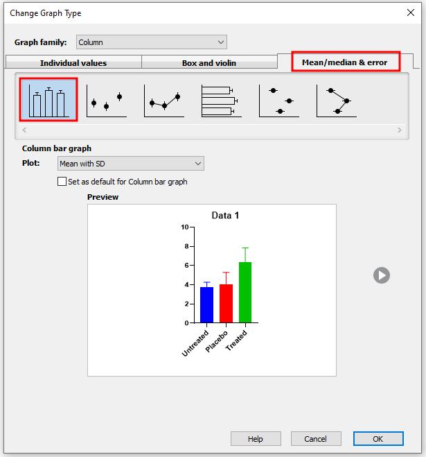
Change the column scatter plot to a bar graph by navigating to Change > Graph Type. By default, Prism chooses to plot the mean with standard deviation (SD).
Format the Graph
Refer to the illustration of the graph below as you make these format changes:
| To: | Do this: |
| Make the axes thicker | Click on the Change button and choose Frame and Origin. Select a thicker setting. |
| Change the bar appearance | Double-click on a bar to bring up the Format Graph dialog. Change fill color, fill pattern, and border thickness. |
| Change the axis numbering | Double-click on the Y axis to bring up the Format Axes dialog. Click on the box labeled Automatically determine the range and interval to deselect it. Then change the tick interval and add major or minor ticks. |
| Thicken the baseline and tick labels | Click on the X or Y axis to select it. Click the Bold button ("B") on the toolbar. |
| Edit the Y axis title | Click on the default Y-axis title; the text will flip to horizontal. When done, click anywhere on the graph to flip it back. Use the formatting buttons under the header Write to enter Greek letters. Edit the X-axis title in the same way. |
| Convert the error bars from SD to SEM or 95% CI | Double-click on a bar to bring up the Format Graph dialog. Change the data set to --- Change ALL data sets --- to make a global change to all data sets on the graph, and use the dropdown box next to Plot. |
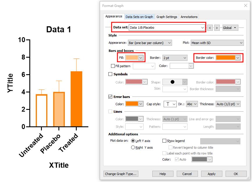
Other Editing Features for Column Bar Graphs
Bar Size, Width, Gaps betweens Bars
These adjustments, which should be self-explanatory, can be made in the Format Graph dialog that you opened before by double-clicking on one of the bars.
Rearranging Bars
In the Format Graph dialog, under Data Sets on Graph, you can drag data sets to rearrange the order they are presented in. You can also choose to increase spacing between certain bars, and separate groups of bars with a vertical line.
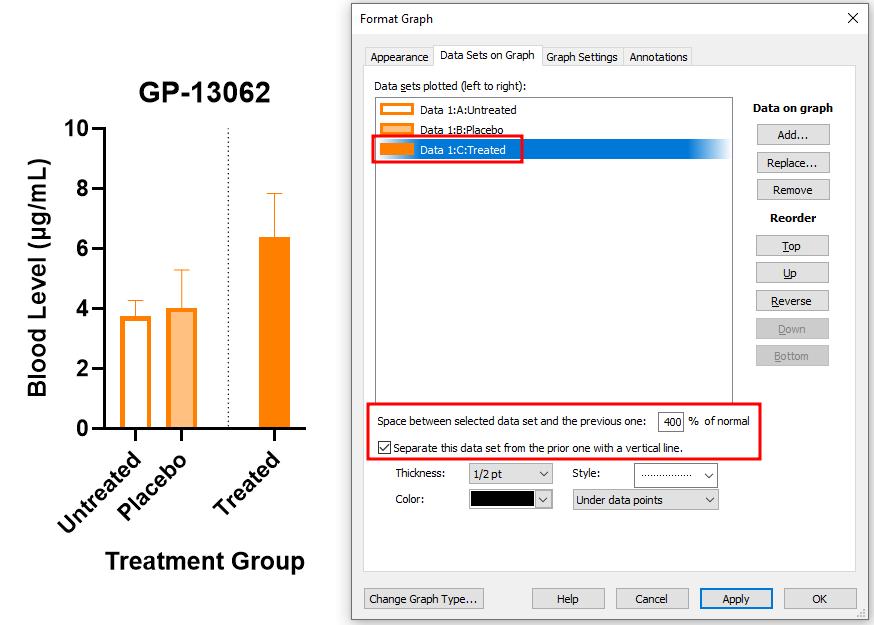
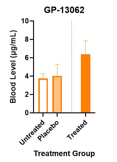
Here is the resulting graph:
Keywords: column bar graph