- Prism
FEATURES
Analyze, graph and present your workComprehensive analysis and statisticsElegant graphing and visualizationsShare, view and discuss your projectsLatest product features and releasesPOPULAR USE CASES
- Enterprise
- Resources
- Support
- Pricing
The Ultimate Guide to Linear Regression
Welcome! When most people think of statistical models, their first thought is linear regression models. What most people don’t realize is that linear regression is a specific type of regression.
With that in mind, we’ll start with an overview of regression models as a whole. Then after we understand the purpose, we’ll focus on the linear part, including why it’s so popular and how to calculate regression lines-of-best-fit! (Or, if you already understand regression, you can skip straight down to the linear part).
This guide will help you run and understand the intuition behind linear regression models. It’s intended to be a refresher resource for scientists and researchers, as well as to help new students gain better intuition about this useful modeling tool.
What is regression?
In its simplest form, regression is a type of model that uses one or more variables to estimate the actual values of another. There are plenty of different kinds of regression models, including the most commonly used linear regression, but they all have the basics in common.
Usually the researcher has a response variable they are interested in predicting, and an idea of one or more predictor variables that could help in making an educated guess. Some simple examples include:
- Predicting the progression of a disease such as diabetes using predictors such as age, cholesterol, etc. (linear regression)
- Predicting survival rates or time-to-failure based on explanatory variables (survival analysis)
- Predicting political affiliation based on a person’s income level and years of education (logistic regression or some other classifier)
- Predicting drug inhibition concentration at various dosages (nonlinear regression)
There are all sorts of applications, but the point is this: If we have a dataset of observations that links those variables together for each item in the dataset, we can regress the response on the predictors. Furthermore:
Fitting a model to your data can tell you how one variable increases or decreases as the value of another variable changes.
For example, if we have a dataset of houses that includes both their size and selling price, a regression model can help quantify the relationship between the two. (Not that any model will be perfect for this!)
The most noticeable aspect of a regression model is the equation it produces. This model equation gives a line of best fit, which can be used to produce estimates of a response variable based on any value of the predictors (within reason). We call the output of the model a point estimate because it is a point on the continuum of possibilities. Of course, how good that prediction actually depends on everything from the accuracy of the data you’re putting in the model to how hard the question is in the first place.
Compare this to other methods like correlation, which can tell you the strength of the relationship between the variables, but is not helpful in estimating point estimates of the actual values for the response.
What is the difference between the variables in regression?
There are two different kinds of variables in regression: The one which helps predict (predictors), and the one you’re trying to predict (response).
Predictors were historically called independent variables in science textbooks. You may also see them referred to as x-variables, regressors, inputs, or covariates. Depending on the type of regression model you can have multiple predictor variables, which is called multiple regression. Predictors can be either continuous (numerical values such as height and weight) or categorical (levels of categories such as truck/SUV/motorcycle).
The response variable is often explained in layman’s terms as “the thing you actually want to predict or know more about”. It is usually the focus of the study and can be referred to as the dependent variable, y-variable, outcome, or target. In general, the response variable has a single value for each observation (e.g., predicting the temperature based on some other variables), but there can be multiple values (e.g., predicting the location of an object in latitude and longitude). The latter case is called multivariate regression (not to be confused with multiple regression).
What are the purposes of regression analysis?
Regression Analysis has two main purposes:
- Explanatory - A regression analysis explains the relationship between the response and predictor variables. For example, it can answer questions such as, does kidney function increase the severity of symptoms in some particular disease process?
- Predictive - A regression model can give a point estimate of the response variable based on the value of the predictors.
How do I know which model best fits the data?
The most common way of determining the best model is by choosing the one that minimizes the squared difference between the actual values and the model’s estimated values. This is called least squares. Note that “least squares regression” is often used as a moniker for linear regression even though least squares is used for linear as well as nonlinear and other types of regression.
What is linear regression?
The most popular form of regression is linear regression, which is used to predict the value of one numeric (continuous) response variable based on one or more predictor variables (continuous or categorical).
Most people think the name “linear regression” comes from a straight line relationship between the variables. For most cases, that’s a fine way to think of it intuitively: As a predictor variable increases, the response either increases or decreases at the same rate (all other things equal). If this relationship holds the same for any values of the variables, a straight line pattern will form in the data when graphed, as in the example below:

However, the actual reason that it’s called linear regression is technical and has enough subtlety that it often causes confusion. For example, the graph below is linear regression, too, even though the resulting line is curved. The definition is mathematical and has to do with how the predictor variables relate to the response variable. Suffice it to say that linear regression handles most simple relationships, but can’t do complicated mathematical operations such as raising one predictor variable to the power of another predictor variable.

The most common linear regression models use the ordinary least squares algorithm to pick the parameters in the model and form the best line possible to show the relationship (the line-of-best-fit). Though it’s an algorithm shared by many models, linear regression is by far the most common application. If someone is discussing least-squares regression, it is more likely than not that they are talking about linear regression.
What are the major advantages of linear regression analysis?
Linear regression models are known for being easy to interpret thanks to the applications of the model equation, both for understanding the underlying relationship and in applying the model to predictions. The fact that regression analysis is great for explanatory analysis and often good enough for prediction is rare among modeling techniques.
In contrast, most techniques do one or the other. For example, a well-tuned AI-based artificial neural network model may be great at prediction but is a “black box” that offers little to no interpretability.
There are some other benefits too:
- Linear regression is computationally fast, particularly if you’re using statistical software. Though it’s not always a simple task to do by hand, it’s still much faster than the days it would take to calculate many other models.
- The popularity of regression models is itself an advantage. The fact that it is a tried and tested approach used by so many scientists makes for easy collaboration.
Assumptions of linear regression
Just because scientists' initial reaction is usually to try a linear regression model, that doesn't mean it is always the right choice. In fact, there are some underlying assumptions that, if ignored, could invalidate the model.
- Random sample - The observations in your data need to be independent from one another. There are many ways that dependence occurs, for example, one common way is with multiple response data, where a single subject is measured multiple times. The measurements on the same individual are presumably correlated, and you couldn’t use linear regression in this case.
- Independence between predictors - If you have multiple predictors in your model, in theory, they shouldn’t be correlated with one another. If they are, this can cause instability in your model fit, although this affects the interpretation of your model rather than the predictions. See more about multicollinearity here.
- Homoscedasticity - Meaning ‘equal scatter,’ this says that your residuals (the difference between the model prediction and the observed values) should be just as variable anywhere along the continuum. This is assessed with residual plots.
- Residuals are normally distributed - In addition to having equal scatter, in the standard linear regression model, the residuals are assumed to come from a normal distribution. This is commonly assessed using a QQ-plot.
- Linear relationship between predictors and response - The relationships must be linear as described above, ruling out some more complicated mathematical relationships. You can model some “curves” in your data using, say, variable X and variable X^2 ("X squared") as predictors.
- No uncertainty in predictor measurements - The model assumes that all of the uncertainty is in the response variable. This is the most nuanced assumption: Even if you’re attempting to make inferences about a model with predictors that are themselves estimates, this would not affect you unless you need to attribute the uncertainty to the predictors. This field of study is called “measurement error.”
Other things to keep in mind for valid inference:
- Representative sample - The dataset you are going to use should be a representative (and random!) sample of the population you’re trying to make inferences about. To use an intuitive example, you should not expect all people to act the same as those in your household. Since we often underestimate our own bias, the best bet is to have a random sample when you start.
- Sample size - If your dataset only has 5 observations in it, the model will be less effective at finding a real pattern (or if one exists) than if it has 100. There is no one-size-fits-all number for every study, but generally 30 or more is considered the low end of what regression needs.
- Stay in range - Don’t try to make predictions outside the range of the dataset you used to build the model. For example, let’s say you are predicting home values based on square footage. If your dataset only has homes between 1,000 and 3,000 square feet, the model may not be a good judge of the value of an 800 or 4,000 square-foot house. This is called extrapolating, and is not recommended.
Types of linear regression
The two most common types of regression are simple linear regression and multiple linear regression, which only differ by the number of predictors in the model. Simple linear regression has a single predictor.
Simple linear regression
It’s called simple for a reason: If you are testing a linear relationship between exactly two continuous variables (one predictor and one response variable), you’re looking for a simple linear regression model, also called a least squares regression line. Are you looking to use more predictors than that? Try a multiple linear regression model. That is the main difference between the two, but there are other considerations and differences involved too.
You can use statistical software such as Prism to calculate simple linear regression coefficients and graph the regression line it produces. For a quick simple linear regression analysis, try our free online linear regression calculator.
Interpreting a simple linear regression model
Remember the y = mx+b formula for a line from grade school? The slope was m, and the y-intercept was b, and both were necessary to draw a line. That’s what you’re basically building here too, but most textbooks and programs will write out the predictive equation for regression this way:
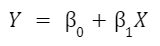
Y is your response variable, and X is your predictor. The two 𝛽 symbols are called “parameters”, the things the model will estimate to create your line of best fit. The first (not connected to X) is the intercept, the other (the coefficient in front of X) is called the slope term.
As an example, we will use a sample Prism dataset with diabetes data to model the relationship between a person’s glucose level (predictor) and their glycosylated hemoglobin level (response). Once we run the analysis we get this output:
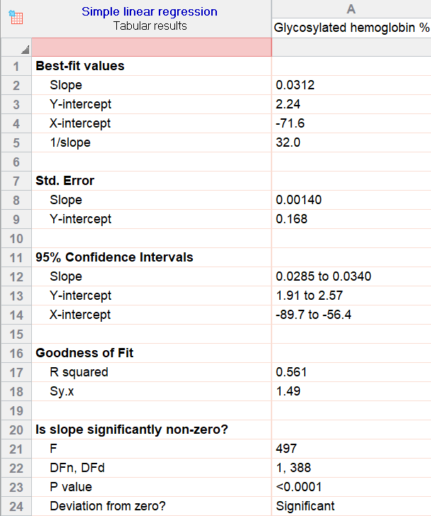
Best-fit parameters and the regression equation
The first section in the Prism output for simple linear regression is all about the workings of the model itself. They can be called parameters, estimates, or (as they are above) best-fit values. Keep in mind, parameter estimates could be positive or negative in regression depending on the relationship.
There you see the slope (for glucose) and the y-intercept. The values for those help us build the equation the model uses to estimate and make predictions:
Glycosylated Hemoglobin = 2.24 + (0.0312*Glucose)
Notice: That same equation is given later in the output, near the bottom of the page.
Using this equation, we can plug in any number in the range of our dataset for glucose and estimate that person’s glycosylated hemoglobin level. For instance, a glucose level of 90 corresponds to an estimate of 5.048 for that person’s glycosylated hemoglobin level. But that’s just the start of how these parameters are used.
Interpreting parameter estimates
You can also interpret the parameters of simple linear regression on their own, and because there are only two it is pretty straightforward.
The slope parameter is often the most helpful: It means that for every 1 unit increase in glucose, the estimated glycosylated hemoglobin level will increase by 0.0312 units. As an aside, if it was negative (perhaps -0.04), we would say a 1 unit increase in glucose would actually decrease the estimated response by -0.04.
The intercept parameter is useful for fitting the model, because it shifts the best-fit-line up or down. In this example, the value it shows (2.24) is the predicted glycosylated hemoglobin level for a person with a glucose level of 0. In cases like this, the interpretation of the intercept isn’t very interesting or helpful.
Simply put, if there’s no predictor with a value of 0 in the dataset, you should ignore this part of the interpretation and consider the model as a whole and the slope. However, notice that if you plug in 0 for a person’s glucose, 2.24 is exactly what the full model estimates.
Confidence intervals and standard error
The next couple sections seem technical, but really get back to the core of how no model is perfect. We can give “point estimates” for the best-fit parameters today, but there’s still some uncertainty involved in trying to find the true and exact relationship between the variables.
Standard error and confidence intervals work together to give an estimate of that uncertainty. Add and subtract the standard error from the estimate to get a fair range of possible values for that true relationship. With this 95% confidence interval, you can say you believe the true value of that parameter is somewhere between the two endpoints (for the slope of glucose, somewhere between 0.0285 and 0.0340).
This method may seem too cautious at first, but is simply giving a range of real possibilities around the point estimate. After all, wouldn’t you like to know if the point estimate you gave was wildly variable? This gives you that missing piece.
Goodness of fit
Determining how well your model fits can be done graphically and numerically. If you know what to look for, there’s nothing better than plotting your data to assess the fit and how well your data meet the assumptions of the model. These diagnostic graphics plot the residuals, which are the differences between the estimated model and the observed data points.
A good plot to use is a residual plot versus the predictor (X) variable. Here you want to look for equal scatter, meaning the points all vary roughly the same above and below the dotted line across all x values. The plot on the left looks great, whereas the plot on the right shows a clear parabolic shaped trend, which would need to be addressed.
Another way to assess the goodness of fit is with the R-squared statistic, which is the proportion of the variance in the response that is explained by the model. In this case, the value of 0.561 says that 56% of the variance in glycosylated hemoglobin can be explained by this very simple model equation (effectively, that person’s glucose level).
The name R-squared may remind you of a similar statistic: Pearson’s R, which measures the correlation between any two variables. Fun fact: As long as you’re doing simple linear regression, the square-root of R-squared (which is to say, R), is equivalent to the Pearson’s R correlation between the predictor and response variable.
The reason is that simple linear regression draws on the same mechanisms of least-squares that Pearson’s R does for correlation. Keep in mind, while regression and correlation are similar they are not the same thing. The differences usually come down to the purpose of the analysis, as correlation does not fit a line through the data points.
Significance and F-tests
So we have a model, and we know how to use it for predictions. We know R-squared gives an idea of how well the model fits the data… but how do we know if there is actually a significant relationship between the variables?
A section at the bottom asks that same question: Is the slope significantly non-zero? This is especially important for this model, where the best-fit value (roughly 0.03) seems very close to 0 to the naked eye. How can we feel confident one way or another?
In this case, the slope is significantly non-zero: An F-test gives a p-value of less than 0.0001. F-tests answer this for the model as a whole rather than its individual slopes, but in this case there is only one slope anyway. P-values are always interpreted in comparison to a “significance threshold”: If it’s less than the threshold level, the model is said to show a trend that is significantly different from “no relationship” (or, the null hypothesis). And based on how we set up the regression analysis to use 0.05 as the threshold for significance, it tells us that the model points to a significant relationship. There is evidence that this relationship is real.
If it wasn’t, then we are effectively saying there is no evidence that the model gives any new information beyond random guessing. In other words: The model may output a number for a prediction, but if the slope is not significant, it may not be worth actually considering that prediction.
Graphing linear regression
Since a linear regression model produces an equation for a line, graphing linear regression’s line-of-best-fit in relation to the points themselves is a popular way to see how closely the model fits the eye test. Software like Prism makes the graphing part of regression incredibly easy, because a graph is created automatically alongside the details of the model. Here are some more graphing tips, along with an example from our analysis:

Multiple linear regression
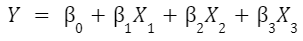
If you understand the basics of simple linear regression, you understand about 80% of multiple linear regression, too. The inner-workings are the same, it is still based on the least-squares regression algorithm, and it is still a model designed to predict a response. But instead of just one predictor variable, multiple linear regression uses multiple predictors.
The model equation is similar to the previous one, the main thing you notice is that it’s longer because of the additional predictors. Let’s say you are using 3 predictor variables, the predictive equation will produce 3 slope estimates (one for each) along with an Intercept term:
Prism makes it easy to create a multiple linear regression model, especially calculating regression slope coefficients and generating graphics to diagnose how well the model fits.
What do I need to know about multicollinearity?
The assumptions for multiple linear regression are discussed here. With multiple predictors, in addition to the interpretation getting more challenging, another added complication is with multicollinearity.
Multicollinearity occurs when two or more predictor variables “overlap” in what they measure. In other places you will see this referred to as the variables being dependent of one another. Ideally, the predictors are independent and no one predictor influences the values of another.
There are various ways of measuring multicollinearity, but the main thing to know is that multicollinearity won’t affect how well your model predicts point values. However, it garbles inference about how each individual variable affects the response.
For example, say that you want to estimate the height of a tree, and you have measured the circumference of the tree at two heights from the ground, one meter and two meter. The circumferences will be highly correlated. If you include both in the model, it’s very possible that you could end up with a negative slope parameter for one of those circumferences. Clearly, a tree doesn't get shorter when the circumference gets larger. Instead, that negative slope coefficient is acting as an adjustment to the other variable.
What is the difference between simple linear regression and multiple linear regression?
Once you’ve decided that your study is a good fit for a linear model, the choice between the two simply comes down to how many predictor variables you include. Just one? Simple linear. More than that? Multiple linear.
Based on that, you may be wondering, “Why would I ever do a simple linear regression when multiple linear regression can account for more variables?” Great question!
The answer is that sometimes less is more. A common misconception is that the goal of a model is to be 100% accurate. Scientists know that no model is perfect, it is a simplified version of reality. So the goal isn’t perfection: Rather, the goal is to find as simple a model as possible to describe relationships so you understand the system, reach valid scientific conclusions, and design new experiments.
Still not convinced? Let’s say you were able to create a model that was 100% accurate for each point in your dataset. Most of the time if you’ve done this, you’ve done one of two things:
- Come to an obvious conclusion that isn’t practically useful (100% of winning basketball teams score more points than their opponent) OR
- You’ve modeled not only the trend in your data, but also the random “noise” that is too variable to count on. This is called “overfitting”: You tried so hard to account for every aspect of the past that the model ignores the differences that will arise in the future.
Other differences pop up on the technical side. To give some quick examples of that, using multiple linear regression means that:
- In addition to the overall interpretation and significance of the model, each slope now has its own interpretation and question of significance.
- R-squared is not as intuitive as it was for simple linear regression.
- Graphing the equation is not a single line anymore. You could say that multiple linear regression just does not lend itself to graphing as easily.
All in all: simple regression is always more intuitive than multiple linear regression!
Interpreting multiple linear regression
We’ve said that multiple linear regression is harder to interpret than simple linear regression, and that is true. Taking the math and more technical aspects out of the question, overall interpretation is always harder the more factors are involved. But while there are more things to keep track of, the basic components of the thought process remain the same: parameters, confidence intervals and significance. We even use the model equation the same way.
Let’s use the same diabetes dataset to illustrate, but with a new wrinkle: In addition to glucose level, we will also include HDL and the person’s age as predictors of their glycosylated hemoglobin level (response). Here’s the output from Prism:

Analysis of variance and F-tests
While most scientists’ eyes go straight to the section with parameter estimates, the first section of output is valuable and is the best place to start. Analysis of variance tests the model as a whole (and some individual pieces) to tell you how good your model is before you make sense of the rest.
It includes the Sum of Squares table, and the F-test on the far right of that section is of highest interest. The “Regression” as a whole (on the top line of the section) has a p-value of less than 0.0001 and is significant at the 0.05 level we chose to use. Each parameter slope has its own individual F-test too, but it is easier to understand as a t-test.
Parameter estimates and T-tests
Now for the fun part: The model itself has the same structure and information we used for simple linear regression, and we interpret it very similarly. The key is to remember that you are interpreting each parameter in its own right (not something you have to keep in mind with only one parameter!). Prism puts all of the statistics for each parameters in one table, including (for each parameter):
- The parameter’s estimate itself
- Its standard error and confidence interval
- A P-value from a t-test
The estimates themselves are straightforward and are used to make the model equation, just like before. In this case the model’s predictive equation is (when rounding to the nearest thousandth):
Glycosylated Hemoglobin = 1.870 + 0.029*Glucose - 0.005*HDL +0.018*Age
If you remember back to our simple linear regression model, the slope for glucose has changed slightly. That is because we are now accounting for other factors too. This distinction can sometimes change the interpretation of an individual predictor’s effect dramatically.
When interpreting the individual slope estimates for predictor variables, the difference goes back to how Multiple Regression assumes each predictor is independent of the others. For simple regression you can say “a 1 point increase in X usually corresponds to a 5 point increase in Y”. For multiple regression it’s more like “a 1 point increase in X usually corresponds to a 5 point increase in Y, assuming every other factor is equal.” That may not seem like a big jump, but it acknowledges 1) that there are more factors at play and 2) the need for those predictors to not have influence on one another for the model to be helpful.
The standard errors and confidence intervals are also shown for each parameter, giving an idea of the variability for each slope/intercept on its own. Interpreting each one of these is done exactly the same way as we mentioned in the simple linear regression example, but remember that if multicollinearity exists, the standard errors and confidence intervals get inflated (often drastically).
On the end are p-values, which as you might guess, are interpreted just like we did for the first example. The underlying method behind the p-value here is a T-test. These only tell how significant each of the factors are, to evaluate the model as a whole we would need to use the F-test at the top.
Evaluating each on its own though is still helpful: In this case it shows that while the other predictors are all significant, HDL shows no significance since we have already considered the other factors. That is not to say that it has no significance on its own, only that it adds no value to a model of just glucose and age. In fact, now that we know this, we could choose to re-run our model with only glucose and age and dial in better parameter estimates for that simpler model.
Another difference in interpretation occurs when you have categorical predictor variables such as sex in our example data. When you add categorical variables to a model, you pick a “reference level.” In this case (image below), we selected female as our reference level. The model below says that males have slightly lower predicted response than females (about 0.15 less).

Goodness of fit
Assessing how well your model fits with multiple linear regression is more difficult than with simple linear regression, although the ideas remain the same, i.e., there are graphical and numerical diagnoses.
At the very least, it’s good to check a residual vs predicted plot to look for trends. In our diabetes model, this plot (included below) looks okay at first, but has some issues. Notice that values tend to miss high on the left and low on the right.

However, on further inspection, notice that there are only a few outlying points causing this unequal scatter. If you see outliers like above in your analysis that disrupt equal scatter, you have a few options.
As for numerical evaluations of goodness of fit, you have a lot more options with multiple linear regression. R-squared is still a go-to if you just want a measure to describe the proportion of variance in the response variable that is explained by your model. However, a common use of the goodness of fit statistics is to perform model selection, which means deciding on what variables to include in the model. If that’s what you’re using the goodness of fit for, then you’re better off using adjusted R-squared or an information criterion such as AICc.
Graphing multiple linear regression
Graphs are extremely useful to test how well a multiple linear regression model fits overall. With multiple predictors, it’s not feasible to plot the predictors against the response variable like it is in simple linear regression. A simple solution is to use the predicted response value on the x-axis and the residuals on the y-axis (as shown above). As a reminder, the residuals are the differences between the predicted and the observed response values. There are also several other plots using residuals that can be used to assess other model assumptions such as normally distributed error terms and serial correlation.
Model selection - choosing which predictor variables to include
How do you know which predictor variables to include in your model? It’s a great question and an active area of research.
For most researchers in the sciences, you’re dealing with a few predictor variables, and you have a pretty good hypothesis about the general structure of your model. If this is the case, then you might just try fitting a few different models, and picking the one that looks best based on how the residuals look and using a goodness of fit metric such as adjusted R-square or AICc.
Why doesn't my model fit well?
There are a lot of reasons that would cause your model to not fit well. One reason is having too much unexplained variance in the response. This could be because there were important predictor variables that you didn’t measure, or the relationship between the predictors and the response is more complicated than a simple linear regression model. In this last case, you can consider using interaction terms or transformations of the predictor variables.
If prediction accuracy is all that matters to you, meaning that you only want a good estimate of the response and don’t need to understand how the predictors affect it, then there are a lot of clever, computational tools for building and selecting models. We won’t cover them in this guide, but if you want to know more about this topic, look into cross-validation and LASSO regression to get started.
Interactions
Interactions and transformations are useful tools to address situations where your model doesn't fit well by just using the unmodified predictor variables.
Interaction terms are found by multiplying two predictor variables together to create a new “interaction” variable. They greatly increase the complexity of describing how each variable affects the response. The primary use is to allow for more flexibility so that the effect of one predictor variable depends on the value of another predictor variable.
For a specific example using the diabetes data above, perhaps we have reason to believe that the effect of glucose on the response (hemoglobin %) changes depending on the age of the patient. Stats software makes this simple to do, but in effect, we multiply glucose by age, and include that new term in our model. Our new model when rounded is:
Glycosylated Hemoglobin = 0.42 + 0.044*Glucose - 0.004*HDL +0.044*Age - .0003*Glucose*Age
For reference, our model without the interaction term was:
Glycosylated Hemoglobin = 1.865 + 0.029*Glucose - 0.005*HDL +0.018*Age
Adding the interaction term changed the other estimates by a lot! Interpreting what this means is challenging. At the very least, we can say that the effect of glucose depends on age for this model since the coefficients are statistically significant. We might also want to say that high glucose appears to matter less for older patients due to the negative coefficient estimate of the interaction term (-0.0002). However, there is very high multicollinearity in this model (and in nearly every model with interaction terms), so interpreting the coefficients should be done with caution. Even with this example, if we remove a few outliers, this interaction term is no longer statistically significant, so it is unstable and could simply be a byproduct of noisy data.

Transformations
In addition to interactions, another strategy to use when your model doesn't fit your data well are transformations of variables. You can transform your response or any of your predictor variables.
Transformations on the response variable change the interpretation quite a bit. Instead of the model fitting your response variable, y, it fits the transformed y. A common example where this is appropriate is with predicting height for various ages of an animal species. Log transformations on the response, height in this case, are used because the variability in height at birth is very small, but the variability of height with adult animals is much higher. This violates the assumption of equal scatter.
In the plots below, notice the funnel type shape on the left, where the scatter widens as age increases. On the right hand side, the funnel shape disappears and the variability of the residuals looks consistent.
The linear model using the log transformed y fits much better, however now the interpretation of the model changes. Using the example data above, the predicted model is:
ln(y) = -0.4 + 0.2 * x
This means that a single unit change in x results in a 0.2 increase in the log of y. That doesn't mean much to most people. Instead, you probably want your interpretation to be on the original y scale. To do that, we need to exponentiate both sides of the equation, which (avoiding the mathematical details) means that a 1 unit increase in x results in a 22% increase in y.
All of that is to say that transformations can assist with fitting your model, but they can complicate interpretation.
When linear regression doesn't work
The ubiquitous nature of linear regression is a positive for collaboration, but sometimes it causes researchers to assume (before doing their due diligence) that a linear regression model is the right model for every situation. Sometimes software even seems to reinforce this attitude and the model that is subsequently chosen, rather than the person remaining in control of their research.
Sure, linear regression is great for its simplicity and familiarity, but there are many situations where there are better alternatives.
Other types of regression
Logistic regression
Linear vs logistic regression: linear regression is appropriate when your response variable is continuous, but if your response has only two levels (e.g., presence/absence, yes/no, etc.), then look into simple logistic regression or multiple logistic regression.
Poisson regression
If instead, your response variable is a count (e.g., number of earthquakes in an area, number of males a female horseshoe crab has nesting nearby, etc.), then consider Poisson regression.
Nonlinear regression
For more complicated mathematical relationships between the predictors and response variables, such as dose-response curves in pharmacokinetics, check out nonlinear regression.
ANOVA
If you’ve designed and run an experiment with a continuous response variable and your research factors are categorical (e.g., Diet 1/Diet 2, Treatment 1/Treatment 2, etc.), then you need ANOVA models. These are differentiated by the number of treatments (one-way ANOVA, two-way ANOVA, three-way ANOVA) or other characteristics such as repeated measures ANOVA.
Principal component regression
Principal component regression is useful when you have as many or more predictor variables than observations in your study. It offers a technique for reducing the “dimension” of your predictors, so that you can still fit a linear regression model.
Cox proportional hazards regression
Cox proportional hazards regression is the go-to technique for survival analysis, when you have data measuring time until an event.
Deming regression
Deming regression is useful when there are two variables (x and y), and there is measurement error in both variables. One common situation that this occurs is comparing results from two different methods (e.g., comparing two different machines that measure blood oxygen level or that check for a particular pathogen).
Perform your own Linear Regression
Are you ready to calculate your own Linear Regression? With a consistently clear, practical, and well-documented interface, learn how Prism can give you the controls you need to fit your data and simplify nonlinear regression.
Start your 30 day free trial of Prism and get access to:
- A step by step guide on how to perform Linear Regression
- Sample data to save you time
- More tips on how Prism can help your research
With Prism, in a matter of minutes you learn how to go from entering data to performing statistical analyses and generating high-quality graphs.
Analyze, graph and present your scientific work easily with GraphPad Prism. No coding required.