
Graph tip - How do I make a second Y axis and assign particular data sets to it?
This example shows how assign certain data sets to a second Y axis. It also shows how to change the color/font of the axes labels.
How to do it:
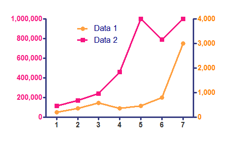
If you have two different data sets with different scales as in the graph below, it is easy to plot one against a second Y axis.

Double-click on either axis to open the Format Axes dialog and go to the Right Y axis tab. Use the roll-down menu to select a right Y axis format.

Then, double-click on any data point to open the Format Graph dialog. Select a data set and use the check box to assign it to the right axis.

If you want to change the color of the font on the axis labels to match your data sets to make the graph easier to understand, double-click on an axis to open the Format Axes dialog and go to the Titles and Fonts tab.

To download this file to see how this graph was made, click here.
With older versions of Prism
- Assign one or more data sets to the right axis. This is done in the "Format Symbols and Lines" dialog for XY graphs, otherwise in the "Format Bars" or "Format Columns" dialog. Under "Plot on Y Axis", choose "Left Y axis" or "Right Y axis".
- With the graph in view, choose "Change...Axes: Range and Ticks". Under "Frame & Axes", select "Plot 2 Y axes".
Related...
Keywords: dual twin double second duplicate two Y axes